The deck opens with a title slide and an introduction to the speaker, Bob Killen, a Program Manager at Google's Open Source Programs Office and a former Kubernetes SIG chair. It then sets up the problem: most contributors to CNCF projects are affiliated with an organisation, yet explaining the business value of that work often feels vague. The middle sections cover three themes. The first is data enablement, which shows how inconsistent labels and milestones make project state hard to measure, with examples of GitHub queries that answer questions about bugs and trends, plus practical triage tools such as Prow. The second is communication, which argues for plain-language descriptions of features, status and roadmaps tailored to audiences from maintainers to executives. The third is two case studies: an end user company defending its open source investment to leadership, and a struggling maintainer who recruited new maintainers through outreach and mentoring. The deck closes with a summary slide and a contact slide.
Slides worth studying
Questions about this deck
How many slides does the Google OSPO presentation deck have?
The Google OSPO deck has 62 slides. Slide 1 is the title slide, "Why is this so HARD! Conveying the Business Value of Open Source".
What does the Google OSPO deck say about label and milestone consistency in CNCF projects?
Slide 15 reports that 50% of labeled issues, 17% of consistently labeled PRs and 58% of consistently used milestones were found. The source was 12 random CNCF projects, 4 of them from the maturity tier.
What does the Google OSPO deck say about the share of CNCF contributions from affiliated organizations?
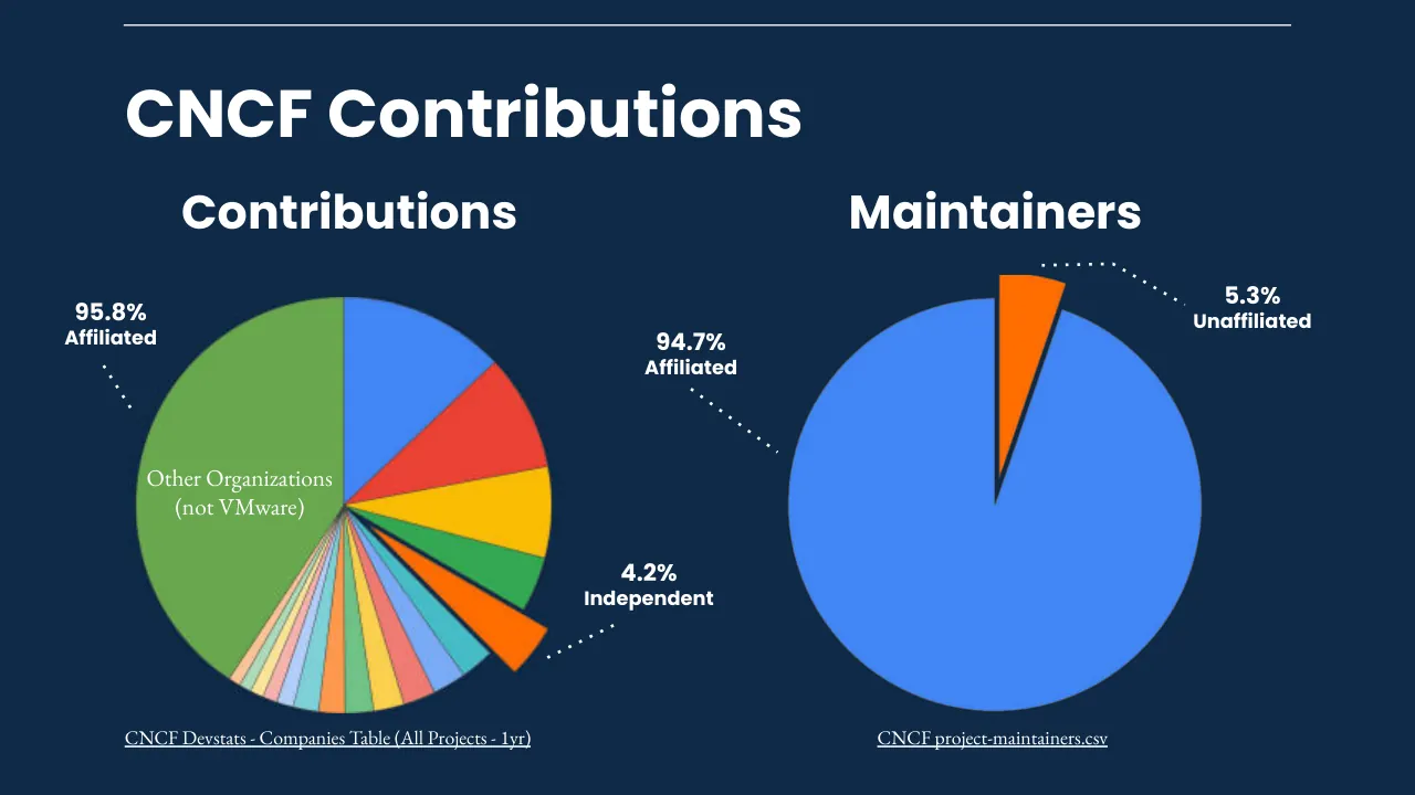
Slide 5 shows 95.8% of CNCF contributions are affiliated and 4.2% are independent, based on CNCF Devstats Companies Table (All Projects - 1yr). Slide 7 separately reports that 52% contributed in both personal and professional time, 30% in professional time only and 18% in personal time only, as of August 2023.
What does the Google OSPO deck say about company bug statistics and contributions in the previous year?
Slide 50 reports 55 total bugs, 11 submitted by company members, 6 company bugs fixed by company members, and a mean time to fix company member bugs of 3~ days. Slide 51 reports 4663 total project contributions, 633 company contributions and 14% company contributions.
Details
- Company: Google OSPO
- Year: 2024
- Type: Conference talk
- Industry: Open source software
- Pages: 62
Review score: 6 out of 10, Needs substantial work
Presentation quality, judged with the SlideDeck Co review heuristic. Ask, evidence and idea merit are not rated here.
The deck has a consistent navy palette, a strong title slide (1), a readable pie chart (6) and a clear before/after pair of examples (35), and the section route (data, communication, two case studies, summary) is easy to follow. But many pages are plain text lists in small serif type with large empty lower halves (24, 25, 27, 52, 55, 56, 61), and the pixelated or blurred avatars (36, 39, 41, 42, 53, 54, 60) look like broken images. The stacked build slides (3/4, 7/8, 10/11, 18 to 21, 34 to 36) inflate the page count and the contact sheets, and the closing summary (61) is thin for a 62-page talk. The core argument can be recovered and a live audience would follow the speaker, but the pages themselves need substantial tidying.
Worth keeping: Keep the dark navy palette with the bold Poppins headings, the title slide (1), the labelled pie charts (6), the before/after plain-language rewrites (35), and the section divider cadence.
Most useful repair: Replace the pixelated placeholder avatars and the colour-swatch circles with crisp images or remove them, enlarge body text on the sparse list slides (24, 25, 27, 56), and collapse the build sequences into fewer final-state slides.
What would change the score: I would add clearer visuals for the case studies and a stronger closing summary that restates the three or four takeaways on one page.
Confidence medium. 62 of 62 pages inspected on contact sheets, 4 at readable size. Reviewed 2026-11-08. Model-assisted review (claude-sonnet-5-5).
Full text of the slides (62 slides)
Every slide's words and a description of its charts and images, so the deck can be searched and rebuilt. Also available as Markdown.
Slide 1
Why is this so HARD!
Conveying the Business Value of Open Source
Bob Killen
@mrbobbytables
Visuals: Full-slide generative chart-like illustration: stacked area bands in many colours (deep blue, teal, muted red, olive, purple, green, orange-brown) forming undulating peaks across the full width, with faint light-grey gridlines (vertical and horizontal) on the dark navy background. The bands are densest and most colourful in the middle and right, with tall spikes near x 96% and x 49%, and the lowest bands are teal-blue at the bottom edge. No axes, labels or legend. The image is full-bleed, not boxed or cropped to a frame, with a dark navy tint so the white text stays legible. Lighting is flat and even; composition is horizontal bands rising to peaks.
Slide 2
👋 Hi. / Program Manager @ Google OSPO / Previously Academia (16 years) / Kubernetes Steering Committee Member / Former Chair of Kubernetes SIG / Contributor Experience / Bob Killen / @mrbobbytables
Visuals: A waving-hand emoji (NotoColorEmoji), yellow with grey motion arcs beside the wave, about 10% of slide width. A circular caricature portrait of a bald, smiling man with black-framed glasses and a full brown beard, wearing a dark collar. Head and shoulders are framed centrally and cropped by the circle. The background behind the head is white with radiating light-blue speed lines. Lighting is flat, with no shading beyond the cartoon outlines. Dominant colours are white, peach skin (about #F2C4AE), brown beard (about #6B4A36), black glasses and slate-blue ring (about #5F7A94). The portrait sits inside a thick slate-blue ring about 2.5% of slide width wide. The slide also contains a white horizontal rule across the top. Four further embedded images are placed in the file (1000 by 365 px behind the bullet list, 408 by 115 px under the portrait, 136 by 128 px behind the emoji, and 277 by 322 px for the portrait); they show no distinct graphic on the slide and appear to be rendering layers for text and shadow.
Slide 3
👋 / Hi. / ● Program Manager @ Google OSPO / ● Previously Academia (16 years) / ● Kubernetes Steering Committee Member / ● Former Chair of Kubernetes SIG Contributor Experience / Bob Killen / @mrbobbytables / End User / Hobby Contributor / Maintainer / Corporate Contributor
Visuals: Circular portrait photograph of a bald man with a full brown beard, rimmed glasses, smiling, facing the camera; head and shoulders, dark clothing at the bottom, light blue-white sunburst-like background; tightly framed and cropped to a circle with a slate-blue ring around it. Waving-hand emoji (yellow hand with motion arcs) left of 'Hi.'. Four rectangular tags with light grey fill (#E3E9ED), dark thin border and slight drop shadow, containing the labels End User, Hobby Contributor, Maintainer and Corporate Contributor. No chart, table or diagram.
Slide 4
Why is this so / HARD! / Conveying the Business Value of Open Source / Bob Killen / @mrbobbytables / [email protected]
Visuals: One decorative illustration fills the entire slide behind all text: a layered streamgraph of many thin stacked bands in colours including teal blue, slate blue, purple, rust red, olive and green, with peaks and troughs that rise to the top right near x 95% and fall toward the lower left. It is made from five placed images: a wide band at x 5.2%, y 30.7%, 63.8% by 28.1%; a larger band at x 44.3%, y 31.3%, 49.9% by 29.9%; a band at x 7.2%, y 57.3%, 77.9% by 11.2%; a lower band at x 7.2%, y 75.1%, 48.9% by 16.7%; and a small patch at x 41.1%, y 56.0%, 16.1% by 13.9%. The graphic is not cropped at the slide edges, is composed as a full-bleed background, is lit flatly with no visible light source, and has no tint over the text area beyond the dark navy base. A faint grid of pale lines is visible in the upper dark area. No logos or icons are present.
Slide 5
CNCF Contributions
Red Hat Inc.
Google LLC
Microsoft Corporation
VMware Inc.
Independent
Isovalent
SUSE LLC
IBM
Splunk Inc.
Dynatrace LLC
Amazon
DaoCloud Network Technology Co. Ltd.
CNCF
Spotify AB
PlanetScale
Huawei Technologies Co Ltd
Nirmata Inc.
Other Organizations
Other Organizations
(not VMware)
95.8%
Affiliated
4.2%
Independent
CNCF Devstats - Companies Table (All Projects - 1yr)
Visuals: Pie chart with title 'CNCF Contributions' shown as slide heading (no separate chart title). Chart type: pie, 18 slices plus one exploded slice, starting at 12 o'clock and running clockwise. Legend at left, listed top to bottom with coloured dots: Red Hat Inc. (blue), Google LLC (red), Microsoft Corporation (yellow), VMware Inc. (green), Independent (orange), Isovalent (teal), SUSE LLC (light blue), IBM (salmon red), Splunk Inc. (gold), Dynatrace LLC (light green), Amazon (orange), DaoCloud Network Technology Co. Ltd. (aqua), CNCF (lavender), Spotify AB (pink), PlanetScale (pale yellow), Huawei Technologies Co Ltd (pale mint), Nirmata Inc. (peach), Other Organizations (olive green). Slice values are printed only for the two callouts: Affiliated 95.8% and Independent 4.2%. Other slices have no printed value; estimates: Red Hat about 12%, Google about 9%, Microsoft about 8%, VMware about 5%, Other Organizations about 40% (largest slice, labelled inside 'Other Organizations (not VMware)'). The Independent slice (orange #FF6D00) is pulled out of the pie and highlighted. Slices have thin dark outlines. No axes or legend beyond the list. Two dotted white leader lines: one from the Affiliated callout down-left to the upper-right of the pie, one from the Independent callout down-left to the exploded orange slice.
Slide 6
CNCF Contributions
Contributions
Maintainers
5.3%
Unaffiliated
95.8%
Affiliated
94.7%
Affiliated
Other Organizations
(not VMware)
4.2%
Independent
CNCF Devstats - Companies Table (All Projects - 1yr)
CNCF project-maintainers.csv
Visuals: Two pie charts, no titles beyond the column headings, no axes, no legend. Left pie, titled 'Contributions', is a pie of contributing organisations split into about 20 slices. The large green slice (#6AA84F) is labelled '95.8% Affiliated' and the label 'Other Organizations (not VMware)' is printed in white serif text inside that slice; it occupies the left half of the pie from 12 o'clock counterclockwise to about 5 o'clock. Going clockwise from 12 o'clock the slices are blue (#4285F4, top), red (#EA4335), yellow (#FBBC04), green (#34A853), and an orange (#FF6D00) slice pulled out from the pie toward the lower right and labelled '4.2% Independent'; then teal, light blue, coral, yellow, green, orange and thin pastel slices (pink, mint, light yellow, light blue) fill the lower-left and lower-right edge, all unlabelled. No values are printed for these small slices. Right pie, titled 'Maintainers', is a pie with a large blue slice (#4285F4) labelled '94.7% Affiliated' occupying about 94.7% of the circle, and a small orange slice (#FF6D00) pulled out at the top, slightly right of 12 o'clock, labelled '5.3% Unaffiliated'. Both pies are flat with no shadows, no 3D, no gradients, and are unboxed.
Slide 7
Personal or Professional?
52% 30% 18%
Contributed in
both personal and
professional time.
Contributed in
professional time
only.
Contributed in
personal time only.
What brings you to open source? - August 2023
Visuals: None. The slide has no photographs, charts, icons, or logos; the three large percentages are typographic text, not graphics.
Slide 8
TL;DR
MOST contributors are contributing
on behalf of an organization.
MOST contributors LIKE and
WANT to contribute more to OSS.
Visuals: Photograph on the right side, boxed to the full right panel, full-bleed to the top, bottom and right slide edges, cropped at the left edge by the navy panel. Subject: a large group of roughly 150 people posed on a wide staircase in an atrium, photographed from a high balcony looking down. Most wear dark clothing and conference lanyards with badges; a few wear bright colours, including a tie-dye shirt in the lower centre, a lime-green jacket and a teal jacket. Some wear face masks. Composition: high oblique aerial framing, the group filling the frame from the lower-left to the upper-right with carpeted steps in the foreground and the atrium balustrade and a red-black angular ceiling panel behind. Lighting is flat, even indoor light. Dominant colours are dark navy, charcoal and black with beige walls and red accents. A navy tint overlay of about 40 to 50 percent opacity covers the photograph, which dulls its colours. A thin white horizontal line of about 1 px sits across the top of both panels.
Slide 9
TL;DR
MOST contributors are contributing
on behalf of an organization.
MOST contributors LIKE and
WANT to contribute more to OSS.
And more importantly…
To get PAID for it!
Visuals: One photograph on the right side, full-bleed to the top, bottom and right edges of the slide, cropped at its left edge by the navy panel. Subject: a large group of about 150 people in business or conference attire with lanyard badges, standing in rows on a wide staircase inside a modern atrium, photographed from an elevated viewpoint looking down and toward the camera. Composition: the group fills the frame from the middle to the bottom, rows receding up the stairs toward the top; the upper part shows a white ceiling with black diagonal beams, a dark red rectangular ceiling panel, a green exit sign, blue wall signs, glass railings and a balcony edge at the right. Lighting: even overhead interior daylight, cool and slightly soft. Dominant colours: white and grey ceiling, charcoal and black clothing, dark purple-brown stair treads, with small accents of bright yellow-green jacket, teal and multicolour patterned shirt. A dark navy tint (about 40 percent opacity) overlays the entire photograph, darkening it. Several people wear face masks. No text or logos are legible on the photo apart from the exit sign.
Slide 10
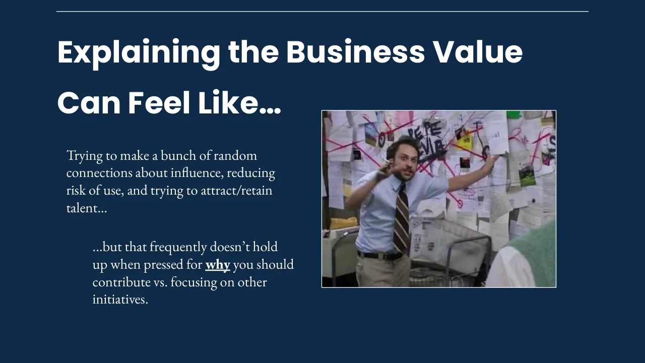
Explaining the Business Value / Can Feel Like… / Trying to make a bunch of random / connections about influence, reducing / risk of use, and trying to attract/retain / talent…
Visuals: One photograph: a man in a light blue collared shirt, brown-and-tan striped tie and khaki trousers with a black belt stands in an office in front of a corkboard covered with pinned papers, photographs and red string. He holds one hand to his ear as if on a phone and extends his other arm toward the board, with a wide-eyed, startled expression. Background includes a metal wire mesh bin and a partially visible person in a green sleeve at the lower right edge. Lighting is flat, indoor fluorescent-like; dominant colours are white and pale paper, pink/red string, light blue shirt, and muted grey-beige. The photo is a rectangular, uncropped-looking frame with a thin white border (about 0.2% of slide width), not full-bleed, sitting on the navy background. Scribbled black lettering on the board reads partially 'PE PE' and 'EVIE' style marks. No overlay or tint. Thin white horizontal rule across the top, about 0.2% of slide height thick, spanning from x 8.8% to x 91.2%.
Slide 11
Explaining the Business Value / Can Feel Like… / Trying to make a bunch of random / connections about influence, reducing / risk of use, and trying to attract/retain / talent… / ...but that frequently doesn’t hold / up when pressed for why you should / contribute vs. focusing on other / initiatives.
Visuals: One photograph, placed as a rectangular boxed image at x 49.9%, y 30.5%, w 37.9%, h 50.6% (577 by 433 pixels). It is not cropped to a special shape, has square corners and a thin white border around the frame. Subject: a man with short dark hair, light blue collared shirt, brown diagonally striped tie, khaki trousers and a black belt, standing in front of a cork-style board covered in pinned papers, photos and red and pink string. His left hand touches his head or ear area and his right arm is stretched out to the board; his mouth is open and his expression is wide-eyed. A partial green sleeve appears at the lower right edge in the foreground and a grey office chair is at the lower centre. Black marker lettering on the board is partly visible (reads roughly PE PE and EVIL). Lighting is flat indoor office lighting with neutral tones. Dominant colours: off-white and grey papers, hot pink and red strings, light blue shirt, brown tie, black marker. The image is full-frame within its box with no overlay or tint.
Slide 12
Data-Enablement
Ensuring the right data is
available to support OSS
investments.
Communication
Providing context in a
human-friendly manner &
telling the story of the data.
Visuals: Two white filled circles, each about 7 percent wide by 12.4 percent high (rendered as circles), sit above the titles. The left circle is centred over the 'Data-Enablement' title and holds a black thin-line icon of a pie chart with a segmented wedge, a magnifier-like arc and short motion ticks. The right circle is centred over the 'Communication' title and holds a black thin-line outline icon of a human head in profile with a gear inside the head. No photographs, charts or diagrams are present.
Slide 13
Data Enablement
aka label all the things
Visuals: A darkened, navy-tinted screenshot of a GitHub pull-request list, cropped at the left by the navy strip and running full height to the right edge. Rows from top to bottom: #123629 by thockin (Google icon) was merged 2 weeks ago, v1.30, partly cut off at the top, with labels sig/apps, sig/cloud-provider, sig/node, sig/scheduling, size/M. #123583 'Add image_id to CRI ContainerStatus message' by saschagrunert was merged 2 weeks ago, v1.30; labels approved, area/kubelet, cncf-cla: yes, kind/cleanup, lgtm, priority/important-longterm, release-note-none, sig/node, size/XL, triage/accepted. #123529 'Go workspaces for k/k and k/staging/*' by thockin (Google icon) was merged 2 weeks ago, v1.30; labels approved, area/apiserver, area/cloudprovider, area/code-generation, area/conformance, area/dependency, area/kube-proxy, area/kubectl, area/kubelet, area/release-eng, area/test, cncf-cla: yes, kind/api-change, kind/bug, kind/cleanup, kind/feature, lgtm, priority/important-soon, release-note, sig/api-machinery, sig/apps, sig/architecture, sig/auth, sig/cli, sig/cloud-provider, sig/cluster-lifecycle, sig/instrumentation, sig/network, sig/node, sig/release, sig/storage, sig/testing, size/XXL, triage/accepted. #123521 by pohly was merged 3 weeks ago, v1.30; title largely hidden behind the headline, labels include approved, area/test, cncf-cla: yes, kind/cleanup, lgtm, needs-priority, needs-triage, release-note, sig/testing. #123442 'KEP ... Make ... Reconstruction as GA' (title partly obscured) by jsafrane was merged last month, v1.30; labels approved, area/kubelet, cncf-cla: yes, kind/cleanup, kind/feature, lgtm, needs-priority, needs-triage, release-note, sig/node, size/XXL. #123399 'test: use cancellation from ktesting' by pohly was merged 2 weeks ago, Approved, v1.30; labels approved, area/kubelet, area/test, cncf-cla: yes, kind/cleanup, lgtm, priority/important-longterm, release-note-none, sig/apps, sig/node, sig/testing, size/XXL, triage/accepted. #123336 'Refactoring to encourage use of switch case' by HyunSu1768 was merged 2 weeks ago, v1.30; labels approved, area/kubelet, cncf-cla: yes, kind/cleanup, lgtm, ok-to-test, priority/backlog, release-note-none, sig/node, size/S, triage/accepted. Each row has a checkbox at its left, a git-branch icon, and grey metadata text. The screenshot is heavily darkened by a navy tint, with the bottom half slightly more obscured by the headline band. Lighting is flat; the dominant colours are dark navy, muted grey text and pastel label chips in blue, green, red, orange and purple. Not boxed; full-bleed.
Slide 14
The Problem with
Insufficient Data
Visuals: Full-bleed photograph of a close-up of a man's face: dark swept-back hair on the left, eyebrows raised, eyes looking upward and to the side, a nose and the edge of an ear visible at the bottom. The top of the head is cropped by the header band and the bottom of the frame cuts off below the nose. Lighting is dim and cool. Dominant colours are dark navy blue, desaturated skin tones in grey-beige, and dark brown hair. A blue tint and darkening overlay cover the whole photograph. A translucent black band sits across the top of the slide over the photograph. A thin white horizontal rule sits above the title. No charts, tables, logos or icons.
Slide 15
Insufficient Data
50%
17%
58%
Labeled Issues
Consistently
Labeled PRs
Consistently
Used Milestones
Source:
●
12 random CNCF projects
●
4 from maturity tier
Visuals: None photographic. Three large stacked statistic numerals (50%, 17%, 58%) are set in white bold sans-serif with a soft dark drop shadow below each glyph. The image boxes listed in the measurements are raster layers of the same shadowed numerals and labels, not separate pictures. Their content is the soft shadow beneath the text, rendered in dark tones on the dark navy background. Also a thin white horizontal rule across the top, from about x 8.75% to x 91.25% at y about 3.1%, about 0.2% of slide height thick.
Slide 16
The Importance of Labels
Labels can
●
Provide context
●
Prioritization
●
Scope
●
State
●
…
Answer Questions &
Track Trends
csi-s3 container cant unmount a volume kind/bug needs-sig needs-triage
#123934 by Artebomba was closed 4 days ago
Failure cluster [c1aa76ec...] pull-kubernetes-e2e-gce-canary consistently failing kind/failing-test sig/testing triage/accepted
#123912 by dims was closed 4 days ago
Issues with runtime handler supported feature lookup kind/bug
kind/regression priority/critical-urgent sig/node triage/accepted
#123906 by tallclair was closed 4 days ago v1.30
Troubleshooting kubeadm (docker has enough images but k8s init still pulls the image) kind/support needs-sig needs-triage
#123901 by linkhacker was closed 5 days ago
[Failing Test] [sig-scheduling] [Feature:GPUDevicePlugin] run Nvidia GPU Device Plugin tests in ci-kubernetes-e2e-gce-device-plugin-gpu-canary kind/failing-test needs-triage sig/k8s-infra
#123890 by pacoxu was closed last week
Visuals: One screenshot of a GitHub-style issue list, boxed with a 1px white outline at x 42.1%, y 23.5%, w 52.1%, h 60.2%, not cropped and not full-bleed. It shows five issue rows on a near-black background (#0D1117 style), each with a checkbox at left, a status icon (grey slash circle for the first row, purple check circles for the others), a bold white-grey title, grey metadata line, and coloured pill labels: kind/bug in red-outline pill, needs-sig and needs-triage in grey pills, kind/failing-test in red pill, sig/testing in brown-grey pill, triage/accepted in green pill, kind/regression and priority/critical-urgent in red pills, sig/node in brown-grey pill, kind/support in purple pill, sig/k8s-infra in tan pill, and a v1.30 milestone tag with a flag icon in the third row. Rows are separated by thin grey dividers; the second row has a slightly lighter background. No photograph or chart; the only icons are the status and milestone glyphs.
Slide 17
Examples / Question: How many bugs were in the 1.30 Kubernetes release? / Query: is:pr label:kind/bug milestone:v1.30 / Answer: 180 / Question: How are we progressing on tech-debt in SIG-Node? / Query: label:kind/cleanup label:sig/node milestone:v1.30 / Answer: 71
Visuals: Two rectangular text panels, each a flat #5F7D95 slate-blue box with a thin white (#FFFFFF) outline of about 0.2% of slide width, containing a question, a query and an answer. Panel 1 is at y 29.4% and panel 2 at y 59.0%, each 23.0% tall. Each query line mixes a serif label with monospace code: 'is:pr', 'label:kind/bug' and 'milestone:v1.30' in panel 1, and 'label:kind/cleanup', 'label:sig/node' and 'milestone:v1.30' in panel 2, with the kind/bug and kind/cleanup and sig/node tokens in bold monospace and the others in regular monospace. No photographs, charts or icons are present.
Slide 18
Example: Bug Trends / Question: / Has Kubernetes Stability / improved over the past 6 / releases? (2 years) / is:pr label:kind/bug milestone:v1.XX / Bugs / Release / 600 / 400 / 200 / 0 / v1.22 / v1.23 / v1.24 / v1.25 / v1.26 / v1.27 / v1.28 / v1.29 / v1.30
Visuals: Area chart (line chart with filled area beneath) embedded as a white-background image. Title: none printed on chart. Y-axis labelled 'Bugs' with tick labels 0, 200, 400, 600 (no units printed); range 0 to about 650. X-axis labelled 'Release' with categories v1.22, v1.23, v1.24, v1.25, v1.26, v1.27, v1.28, v1.29, v1.30. Single series, values not printed; about 625 at v1.22, about 510 at v1.23, about 480 at v1.24, about 375 at v1.25, about 370 at v1.26, about 400 at v1.27, about 318 at v1.28, about 255 at v1.29, about 183 at v1.30. Line colour medium blue (about #3B82F6); area fill light blue (about #C3D9F9). Gridlines light grey horizontal at 200, 400, 600. No legend. No highlighted points. Chart image is boxed with a sharp corner, no border, full white background.
Slide 19
Example: Bug Trends
Question:
Have there been fewer
regressions in newer
Kubernetes releases?
is:pr label:kind/bug label:kind/regression milestone:v1.XX
Visuals: One area chart, shown as a placed image inside a white rectangular box with square corners and no border. Chart title: none printed. Chart type: stacked-look overlapping area chart with two series, each with a solid line on top of a translucent fill. Y axis: titled 'Bugs', labelled ticks 0, 200, 400, 600, with light grey horizontal gridlines at each tick; range about 0 to 650. X axis: titled 'Release', categories v1.22, v1.23, v1.24, v1.25, v1.26, v1.27, v1.28, v1.29, v1.30. Series 1 'Bugs': blue line (about #3B7DED) with light blue fill (about #C5D9F8); no printed values, about 625 at v1.22, about 510 at v1.23, about 480 at v1.24, about 375 at v1.25, about 368 at v1.26, about 398 at v1.27, about 315 at v1.28, about 252 at v1.29, about 180 at v1.30. Series 2 'Regressions': red line (about #E53A2F) with pinkish-mauve fill (about #D4A9BE) where it overlaps the blue area; about 65 at v1.22, about 47 at v1.23, about 47 at v1.24, about 30 at v1.25, about 27 at v1.26, about 48 at v1.27, about 35 at v1.28, about 27 at v1.29, about 8 at v1.30. Legend: centred below the x-axis title, showing a blue square labelled Bugs and a red square labelled Regressions. Highlighted points: none. No other graphics. Code bar: a rectangle filled with slate blue #5F7D95 with a thin light grey-white outline, containing monospace text.
Slide 20
Example: Bug Trends / Question: / Have there been fewer / regressions in newer / Kubernetes releases? / is:pr label:kind/bug label:kind/api-change milestone:v1.XX
Visuals: One chart: a stacked-looking area chart with two series, drawn on a white rectangle (600 by 371 px image, no visible border, not cropped, not full-bleed). Chart type: area/line chart with a light blue filled area under the Bugs line. No chart title. Y-axis titled 'Bugs', range 0 to about 650 with labelled ticks at 0, 200, 400 and 600, light grey horizontal gridlines at each labelled tick. X-axis titled 'Release', categories v1.22, v1.23, v1.24, v1.25, v1.26, v1.27, v1.28, v1.29, v1.30 (labels printed under the axis). Series 1 'Bugs': blue line #3B82F6 with light blue fill #C5D9F8; values not printed, about 625 at v1.22, about 510 at v1.23, about 480 at v1.24, about 375 at v1.25, about 368 at v1.26, about 398 at v1.27, about 315 at v1.28, about 250 at v1.29, about 180 at v1.30. Series 2 'api-change': thin yellow-orange line #FBBC04 near the baseline, values about 25, 18, 22, 10, 13, 14, 18, 8, 11 for v1.22 to v1.30 respectively. No highlighted points. Legend centred below the x-axis title: blue square with 'Bugs' then yellow square with 'api-change'. Code bar: a rectangle with 1px light grey-white stroke, fill #5F7D95, containing monospace code text; no icons or logos.
Slide 21
Example: Bug Trends / Question: / Have there been fewer / regressions in newer / Kubernetes releases? / is:pr / label:kind/bug label:area/kube-proxy / milestone:v1.XX
Visuals: One chart, an area line chart of bug counts per Kubernetes release, shown as a white-background raster image boxed at x 7.0%, y 21.5%, w 53.1%, h 58.4%. No chart title. Y axis labelled 'Bugs' (unit: count of bugs), range 0 to about 650, ticks at 0, 200, 400, 600. X axis labelled 'Release', categories v1.22, v1.23, v1.24, v1.25, v1.26, v1.27, v1.28, v1.29, v1.30. Series 1, 'Bugs' (blue line #3B7DDD with light blue fill #C4D8F8): about 625 at v1.22, about 505 at v1.23, about 480 at v1.24, about 375 at v1.25, about 368 at v1.26, about 398 at v1.27, about 315 at v1.28, about 250 at v1.29, about 180 at v1.30. Series 2, 'kube-proxy' (green line #2EA44F with pale green fill): about 3 at v1.22, about 2 at v1.23, about 1 at v1.24, about 1 at v1.25, about 1 at v1.26, about 2 at v1.27, about 20 at v1.28, about 20 at v1.29, about 12 at v1.30. Values are estimates, none are printed on the chart. Legend centred below the x axis: blue square labelled 'Bugs', green square labelled 'kube-proxy'. No highlighted points. Gridlines light grey horizontal at each y tick. No photograph or logo.
Slide 22
Which is easier?
Left panel:
csi-s3 container cant unmount a volume / kind/bug / needs-sig / needs-triage / #123934 by Ariebordon was closed 4 days ago
Failure cluster [c1aa76ec...] pull-kubernetes-e2e-gce-canary consistently failing / kind/failing-test / sig/testing / triage/accepted / #123912 by dims was closed 4 days ago
Issues with runtime handler supported feature lookup / kind/bug / kind/regression / priority/critical-urgent / sig/node / triage/accepted / #123906 by falcier was closed 4 days ago / v1.30
Troubleshooting kubeadm (docker has enough images but k8s init still pulls the image) / kind/support / needs-sig / needs-triage / #123901 by linkhacker was closed 5 days ago
[Failing Test] [sig-scheduling] [Feature:GPUDevicePlugin] run Nvidia GPU Device Plugin tests in ci-kubernetes-e2e-gce-device-plugin-gpu-canary / kind/failing-test / needs-triage / sig/k8s-infra / #123890 by pacoxu was closed last week
Right panel:
chore(README): typo stpory to story / #3679 by Abhinandan-Purkait was merged on Jan 25
chore(readme): modify contact email id / #3677 by avishnu was merged on Jan 24
Readme update / #3676 by orville-wright was merged on Jan 20
chore(MAINTAINERS): update Maintainers list / #3675 by avishnu was merged on Jan 18
chore(ADOPTERS): add Reformational Study Centre to the adopters' list / #3650 by niladrih was merged on Sep 12, 2023
Visuals: Two screenshots of GitHub issue lists, shown as boxed rectangles with thin white outlines. Left screenshot (about 52% wide, 60% tall, 328 by 213 px source): a dark-mode list of five open or closed issues, each with a grey square checkbox at left, a status icon (circle-check or circle-slash), a bold white title, coloured label pills (red kind/bug, kind/failing-test, kind/regression, kind/support; olive sig/testing, sig/node, sig/k8s-infra; green triage/accepted; grey needs-sig, needs-triage) and a grey metadata line; the image is blurry and low resolution. Right screenshot (about 45% wide, 60% tall, 948 by 680 px source): a dark list of five merged pull requests, each with a purple git-merge branch icon at left, a bold white title, a green check mark after the title and a grey metadata line; rows are separated by thin grey dividers and a thin vertical grey line runs down the left edge of the list. The two screenshots contrast a cluttered, blurred issue list with a clean, crisp merged-PR list. Lighting is flat, with no photographic depth.
Slide 23
Milestones
Milestones offer an incredibly convenient way to associate issues/PRs into a
logical grouping (e.g. releases).
milestone:v1.30
VS
created:2024-03-01..2024-03-05
Items opted into milestone
Glob, queries everything between
date range
Visuals: Two rectangular slate-blue boxes with thin white outlines. The left box, about 22.9% wide, contains the monospace text 'milestone:v1.30'. The right box, about 43.7% wide and the same height, contains 'created:2024-03-01..2024-03-05'. Between them is the bold white text 'VS'. Below the boxes are two captions: 'Items opted into milestone' under the left box, with 'opted into' in bold, and 'Glob, queries everything between date range' under the right box. No charts, photographs, icons or logos.
Slide 24
Why Projects Don’t Triage / Why are so many projects inconsistent with labels and milestones? / ● / Unaware of GitHub Triage role and believe write access is still required to apply / labels & milestones. / ● / Don’t think they actually matter and are just another piece of “overhead” / ● / Too small a project to matter or warrant use.
Slide 25
Helpful Triage Actions
Label Actions
●
Copy Issue Label - Sync issue label to PR following “fixed”, “solved” etc.
●
Pull Request Labeler - Applies labels to PRs based on glob patterns.
●
Label Syncer - Declarative way to ensure labels are consistent across repos/orgs
Project Actions
●
Add To GitHub Projects - Automatically adds Issues / PRs to project boards
based on labels used.
Slide 26
Triage With Prow
Prow
Prow fundamentally encourages label use, and can auto-apply labels via OWNERS files.
Prow-github-actions
Utilities action that mimics Prow functionality.
Example Functions
/milestone <milestone>
/kind <bug|feature|etc>
/area <component>
/label <label name>
/approve & /lgtm
Visuals: One logo image at upper right: a 750 by 250 pixel raster of a Prow-style emblem, a pentagonal shape split into an upper white/light-grey facet block and a lower blue block with horizontal light-blue and mid-blue stripes, outlined in dark grey. Composition is a centred emblem on a transparent or navy background, not cropped, not boxed, with no overlay or tint. Lighting is flat. Dominant colours are white #F2F4F7, light blue #7FA7DC, mid blue #3F5FB5 and dark grey outline #555B63. No charts, tables or photographs.
Slide 27
Data Conclusions
Consistent data from labels & milestones is crucial for surfacing the state of a project and enabling both contributors and businesses to evaluate the impact of investment.
Data provides the evidence to back up your messaging to leadership.
Recruiting people to help with triage and using tools to automate the process can ensure things are properly labeled and milestoned.
Slide 28
Communication
Back to first principles
Visuals: Screenshot of a dark-mode project board table, shown full-bleed and dimmed with a navy overlay. Columns: row number, Title (with a green open-circle or purple check-circle icon before each title), Status (grey pill labels with a small chevron), Stage (grey pill labels with a chevron), and Enhancements Contact (grey pill labels with a chevron). Rows 1 to 19 are visible, and row 20 is cut off at the bottom edge. Row 1: Container Resource based Pod Autoscaling #1610 | Tracked for Code Freeze | Stable | salehsedghpour. Row 2: Introduce MatchLabelKeys to Pod Affinity and Pod Anti Affinity #3633 (MatchLabelKeys in monospace grey box) | Removed from Milestone | Beta | salehsedghpour. Row 3: Portworx file in-tree to CSI driver migration #2589 | Removed from Milestone | Beta | salehsedghpour. Row 4: Projected service account tokens for Kubelet image credential providers #4412 | Removed from Milestone | Alpha | salehsedghpour. Row 5: Transition from SPDY to WebSockets #4006 | Tracked for Code Freeze | Beta | salehsedghpour. Row 6: Remove transient node predicates from KCCM's service controller #3458 | Tracked for Code Freeze | Stable | salehsedghpour. Row 7: Introducing Sleep Action for PreStop Hook #3960 | Tracked for Code Freeze | Beta | salehsedghpour. Row 8: Ensure secret pulled images #2535 | Removed from Milestone | Alpha | salehsedghpour. Row 9: Go work[obscured]s for k/k #4402 (green check-circle icon in purple) | Tracked for Code Freeze | Stable | salehsedghpour. Row 10: client-go[obscured] Add metrics[obscured] informer[obscured] | Removed from Milestone | Alpha | salehsedghpour. Row 11: Decouple TaintManager from NodeLifecycleController #3902 | Removed from Milestone | Stable | salehsedghpour. Row 12: Add more granular failure reason for JobPodFailurePolicy #444[obscured] | Removed from Milestone | Alpha | salehsedghpour. Row 13: Consistent Reads from Cache #2340 | Removed from Milestone | Beta | salehsedghpour. Row 14: DRA: structured parameters #4381 | Tracked for Code Freeze | Alpha | salehsedghpour. Row 15: CBOR Serializer #4222 | Removed from Milestone | Alpha | salehsedghpour. Row 16: Make Kubernetes aware of the LoadBalancer behaviour #1860 | Tracked for Code Freeze | Beta | salehsedghpour. Row 17: Reduction of Secret-based Service Account Tokens #2799 | Tracked for Code Freeze | Stable | sreeram-venkitesh. Row 18: Bound service account token improvements #4193 | Tracked for Code Freeze | Beta | sreeram-venkitesh. Row 19: Always Honor PersistentVolume Reclaim Policy #2644 | Removed from Milestone | Beta | sreeram-venkitesh. Header row: Title / Status / Stage / Enhancements Contact, with ellipsis menus and a sort icon. Table is dimmed by a navy overlay at roughly 60% opacity, and the screenshot is not cropped.
Slide 29
OSS Enthusiast / ● / Knows how to navigate OSS Ecosystem & projects well / ● / Does not mind diving deep into technical details / ● / May be participating as a hobby or as part of their job duties
Visuals: One circular photograph (cropped to a circle) of an anime-style character: a young figure with tousled red and dark brown hair, green-tinted goggles over the eyes, a broad toothy grin, and a slight red blush on the cheeks. The figure is shown from the chest up, facing the viewer, against a blue sky backdrop with white clouds. Lighting is flat and even, as in a cel-animated frame. Dominant colours are red, dark brown, skin tan, and cobalt blue. The circle has a white outline ring. A second image entry (621 by 478 px) shares the same box as the full left panel but is not distinguishable on the rendered slide. A thin white horizontal line runs across the top of the slide.
Slide 30
OSS Enthusiast (Maintainer)
●
Knows how to navigate OSS Ecosystem well projects well
●
Does not mind diving deep into technical details
●
May be participating as a hobby or as part of their job
duties
●
Burned Out, does not understand why more people don’t
contribute
●
Does “Hero” work to keep project(s) going
●
…does not like to do project management / non-code type work
…generally
Visuals: One circular illustration at x 7.0%, y 14.5%, 20.8% wide by 36.4% high (160 by 158 px source). It is a cropped anime-style illustration of a red-haired boy with purple-lensed goggles pushed up on his forehead, one hand on his head, eyes half-closed, a small dark nose mark, red blush marks on both cheeks and a pursed, frowning mouth. It is framed by a thin white circular ring about 0.3% of the height wide. Dominant colours are reddish-orange hair, tan skin (#B8745A approx.), purple goggles and dark maroon background. Flat, even lighting with no overlay or tint. A second embedded image of 621 by 478 px is placed at x 0.0%, y 14.5%, 44.7% by 74.1%, but it is not visible on the rendered slide because the full-slide background fill covers it. A white horizontal line at the top, 0.2% high, spans x 8.75% to 91.25% at y 3.0%.
Slide 31
Leadership (VPs, SVPs, C*Os) / Concerned with resources, health / and growth of company. Focused on / Health of business, opportunities & / risks. Prioritizes Return of / Investment. Least technical. / Product Managers / Prioritizes making the best product. / Skilled at conveying technical details / in user friendly fashions. Desires / customer/user feedback. / Managers / Leads / Concerned about employees and / meeting org objectives. Better / understanding of tech and / knowledge of what team is working / on. Intermediary between team and / leadership. / End User / Prioritizing how tools, features, etc / can benefit them / their / organization. Diverse range of / technical skill. Bombarded by / options.
Visuals: Four circular photographs, each about 11.7 percent of slide width by 20.8 percent of slide height, with a white circular border about 3 px wide. Top left: a man in a dark navy suit, light blue shirt and striped tie, holding a white mug printed WORLD'S BEST BOSS, with bookshelves behind him; he looks at the camera with raised eyebrows and a pursed mouth; warm indoor light; dominant colours navy, white and brown; full head and shoulders visible, cropped to the circle. Top right: a man in a navy knit sweater vest over a light blue collared shirt, both hands raised with fingers splayed in a tense, grimacing expression, against a blurred background of blue, red and yellow tones; cropped to the circle. Bottom left: a smiling woman with shoulder-length wavy blonde hair in a dark top, against a bright sky and green trees, warm natural light; cropped to the circle. Bottom right: a golden retriever with open mouth and a pink collar lying on a cluttered desk beside computer equipment and a framed black and white photograph on the wall; warm tan and grey tones; cropped to the circle. No charts, tables or overlays.
Slide 32
Limiting growth
If it takes unnecessary additional cognitive overhead to:
- Understand in basic terms what that feature does
- Find your roadmap or the features & initiatives you’re working on
- Know what parts of the project/feature/initiative are at risk
You are losing potential users, future contributors, and
making it more difficult to justify further investment of
resources (e.g. headcount)
Slide 33
Example 1 / Before: / “This KEP proposes an automatic topology aware hinting mechanism that / would provide a way for EndpointSlice producers to indicate where / consumers should use specific endpoints.”
Visuals: One circular portrait, cropped to a circle with a thin white ring border. It shows a cartoon-style anime character with red hair, blue-purple goggles pushed up on the forehead, one hand on the head, squinting tearful eyes with white tear streaks, red blush on the cheeks and a flat, downturned mouth. Dominant colours are peach-salmon skin, dark maroon and red hair and background, with purple goggle lenses. Lighting is flat, with no visible shading direction. Framing is a head-and-shoulders close crop. No chart, table or other graphic is present.
Slide 34
Example 1 / Before: / “This KEP proposes an automatic topology aware hinting mechanism that / would provide a way for EndpointSlice producers to indicate where / consumers should use specific endpoints.” / wut?
Visuals: Two photographs and one rule. (1) A circular avatar at the left of the quote, showing a pixelated close-up of a child with red-orange hair and glasses, cropped to a circle with a thin white outline. (2) A rectangular meme photograph at lower right: a young blonde toddler in a dark grey car seat with a purple top and a dark seatbelt harness, making a skeptical squint and pursed-lip expression, with the words 'wut?' in white outlined bold sans-serif letters overlaid at the top centre of the image. The photo has a thin white border and square corners, with bright, slightly soft daylight and a neutral grey and purple palette. The rule is a thin white horizontal line at the top of the slide.
Slide 35
Example 1
Before:
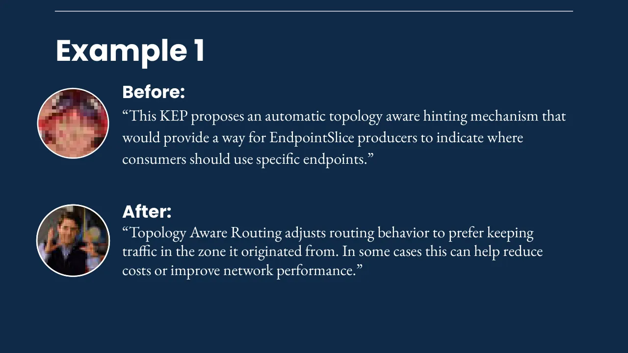
“This KEP proposes an automatic topology aware hinting mechanism that / would provide a way for EndpointSlice producers to indicate where / consumers should use specific endpoints.”
After:
“Topology Aware Routing adjusts routing behavior to prefer keeping / traffic in the zone it originated from. In some cases this can help reduce / costs or improve network performance.”
Visuals: Two circular portrait photographs, both cropped to circles with a thin white stroke (about 0.3% of the height). Top portrait: a heavily pixelated, low-resolution face (20 by 20 pixel source) with dominant colours dark maroon, red and pale pink, shown head and shoulders, centred in its circle, under even light. Bottom portrait: a man with short dark hair in a dark jacket over a light blue collared shirt, both hands raised with fingers spread in front of him, against a dim background of dark walls and warm blurred lights, shown from the chest up, centred in a circle, lit from the front. Neither image has an overlay or tint. A third, very small image (80 by 45 pixels, measured at x 1.7%, y 58.2%, w 19.8%, h 19.8%) is present in the file but is not visible on the rendered slide, so it is recorded as a hidden element. No charts, tables or diagrams.
Slide 36
Example 2 / Before: / “This KEP proposes to allow mutating spec.completions for / Indexed job if spec.completions equals to / spec.parallelism before and after the update, meaning that / spec.completions is mutable only in tandem with / spec.parallelism.”
Visuals: One pixelated photograph, a 10 by 10 pixel mosaic cropped to a circle and placed at the left of the 'Before:' text. Its subject is not discernible; it shows a blocky arrangement of skin-toned, salmon, rose and dark maroon pixels, with the darkest pixels at the top edge and the lower-left area lighter. It is lit evenly, with no visible light direction, and is framed tightly as a circle with a thin white ring around it. A horizontal white line runs across the top of the slide as a rule. No charts, tables or icons.
Slide 37
Example 2
Before:
“This KEP proposes to allow mutating spec.completions for
Indexed job if spec.completions equals to
spec.parallelism before and after the update, meaning that
spec.completions is mutable only in tandem with
spec.parallelism.”
After:
“Enables autoscaling for Indexed Jobs”
I can get behind that!
Visuals: Five non-text visuals. (1) Top-left circular avatar at x 6.1%, y 25.3%, w 11.0%, h 19.3%: a heavily pixelated mosaic of a face in red, rust, salmon and dark maroon tones, cropped to a circle with a white outline about 2 px wide. (2) Lower-left circular avatar at x 3.5%, y 66.7%, w 14.8%, h 19.6%: a flat cartoon illustration of a golden-brown dog wearing dark headphones or a headset, typing on a keyboard in a dark brown and olive control-room setting with yellow-green screen glow, cropped to a circle with a white outline. (3) Bottom-right circular photo at x 68.0%, y 75.3%, w 16.9%, h 19.8%: a man in a dark suit, white shirt and blue tie holding a white mug printed "WORLD'S BEST BOSS", seated in an office with a warm, dim interior, shown as a circle with a white outline. (4) Bottom-right circular photo at x 82.1%, y 75.4%, w 14.9%, h 19.8%: a golden retriever with a purple collar on a cluttered background of greys and browns, cropped to a circle with a white outline. (5) Speech bubble at x 72.2%, y 58.3%, w 23.1%, h 14.9%: a white rounded rectangle with a downward-pointing triangular tail at its lower left that points to the first circular photo, and a second tail at its lower right pointing to the dog photo; text "I can get behind that!" is centred inside it.
Slide 38
Surfacing Information / Information regarding roadmaps, features, and their state should be easily accessible and written for a wide audience. / ● Regular Project Reports / Blog posts / ● Roadmap on website / ● GitHub Project Board
Visuals: One small circular photograph at the right of the bullet list, about 21% of slide width, roughly 47 by 36 pixels in the source. It shows a close-up, low-resolution (pixelated) view of what appears to be a cluttered workspace with objects in beige, grey, dark brown and orange tones, with a purple-blue patch in the centre-left; the framing is tight and the subject is not clearly identifiable. The image is cropped to a circle with a thin white outline about 0.3% of slide height. No overlays or tints are visible. A thin white horizontal line spans the top margin from roughly x 8.7% to x 91.3% at about y 3%, acting as a rule.
Slide 39
Project Boards
Project Boards are highly
automatable via graphQL
API
Support for multiple views
Exportable as tsv
Kubernetes Release Team Board Automation Scripts
Visuals: Two circular portrait photographs and one bordered screenshot of a software project-board table. Left circle: a blurred, heavily pixelated portrait of a person with light brown hair against a bright yellow-green and blue outdoor background, lit by daylight, cropped to a circle with a thin white ring about 2 px wide. Right circle: a heavily pixelated portrait of a person in dark clothing with reddish-brown and grey tones, dark navy and black at the bottom, cropped to a circle with a thin white ring. Screenshot: a dark-mode table titled '1.30 Enhancements Tracking' with a globe icon, tabs 'Enhancements' (selected, with a dropdown chevron), 'PRR', 'Docs', 'Comms', 'Feature Blogs', 'Code Freeze Exceptio' (truncated), and '+ New view'; a filter bar reading 'Filter by keyword or by field'; column headers Title, Status and Stage, each with a ... menu; 14 rows, each with a row number, a green open-circle icon (row 9 has a purple check icon), a title with issue number, a Status pill and a Stage pill: 1 Container Resource based Pod Autoscaling #1610 / Tracked for Code Freeze / Stable. 2 Introduce MatchLabelKeys to Pod Affinity and Pod Anti Affinity #3633 / Removed from Milestone / Beta. 3 Portworx file in-tree to CSI driver migration #2589 / Removed from Milestone / Beta. 4 Projected service account tokens for Kubelet image credential providers #4412 / Removed from Milestone / Alpha. 5 Transition from SPDY to WebSockets #4006 / Tracked for Code Freeze / Beta. 6 Remove transient node predicates from KCCM's service controller #3458 / Tracked for Code Freeze / Stable. 7 Introducing Sleep Action for PreStop Hook #3960 / Tracked for Code Freeze / Beta. 8 Ensure secret pulled images #2535 / Removed from Milestone / Alpha. 9 Go workspaces for k/k #4402 / Tracked for Code Freeze / Stable. 10 client-go: Add metrics into informer #4346 / Removed from Milestone / Alpha. 11 Decouple TaintManager from NodeLifecycleController #3902 / Removed from Milestone / Stable. 12 Add more granular failure reason for Job PodFailurePolicy #4443 / Removed from Milestone / Alpha. 13 Consistent Reads from Cache #2340 / Removed from Milestone / Beta. 14 DRA: structured parameters #4381 / Tracked for Code Freeze / Alpha. Row backgrounds are near-black with thin grey row dividers; status pills are dark grey with light grey text; stage pills are dark with light grey text; text is light grey-white on near-black, with the screenshot framed by a 1 px white border.
Slide 40
Status & Roadmap / Issue / Description / Status / Notes / Target / Tracking Issue / - “Friendly” short description. / - Parsed from tracking issue body / - Alpha/Beta/Stable / - / Red/Yellow/Green / - Optional notes to describe status / - Parsed from tracking issue body / Target Release / ● Discoverable and easy to link to / ● Provides just enough information to convey feature / initiative state & target release / ● Status field can be used to signal things that are at risk / ● Easily mappable to internal tracking information
Visuals: Three circular pixelated photographs in a vertical stack on the left, each with a white ring stroke of about 2px. Top: a 5 by 3 pixel mosaic, dominated by dark maroon-brown, near-black at the bottom centre, and warm brown tones. Middle: a 6 by 8 pixel mosaic of olive green, ochre, tan, pale cream and yellow-green tones, with a slate-blue pixel at the top. Bottom: a 24 by 18 pixel mosaic of dark brown, cream, grey, purple-brown and orange tones, possibly a textured close-up. None are cropped beyond the circle mask; all are full colour with no overlay. The table is a grid of white 2px borders with a steel-blue header row (#5F7D95) and five columns: Issue (about 11% wide), Description (about 23%), Status (about 15%), Notes (about 24%), Target (about 11%). The header row holds Issue, Description, Status, Notes, Target. The body row holds Tracking Issue; - “Friendly” short description. / - Parsed from tracking issue body; - Alpha/Beta/Stable / - / Red/Yellow/Green; - Optional notes to describe status / - Parsed from tracking issue body; Target Release. No chart, legend or highlighted points.
Slide 41
Talking to Leadership
●
How critical is the project? Can you associate $$ or
level of risk with it.
●
How many SWE hours are being spent?
●
What is the business getting in return for those SWE
hours? What happens if you stop?
○
List features, bugs - both driven by you, and
ones that your org uses that you influenced, and
others that were completely developed by
others.
Leadership (VPs, SVPs, C*Os)
○
Try to associate with anything internal and $$
Concerned with resources, health
and growth of company. Focused on
Health of business, opportunities &
risks. Prioritizes Return of
Investment. Least technical.
Visuals: One photograph, a very low-resolution pixelated portrait (32 by 20 pixels, enlarged so the blocks are visible), cropped to a circle and framed by a thin white stroke (about 2 px). It appears to show a person's head and shoulders, roughly centred, filling the circle. Colours: pale pinks and beige at upper left, rusty reddish-brown tones at top centre, dark brown and black in the lower right, lavender and mauve-grey at lower left, and near-black navy shadows in the centre. Lighting is diffuse and frontal with no visible overlay or tint. The photo is not full-bleed; it is a boxed image (measured 2.2%, 22.1%, 29.4% by 34.5%) masked to a circle. No other visuals; the rule at top is a plain line.
Slide 42
Managers & Users / ● / What is the roadmap? / ● / What is the status of items on the roadmap? And the / things directly impacting us. / ● / What features / things are at risk? / ○ / If at risk, what is needed? / ● / What are the blockers / bugs? / ● / Managers: what is my team involved in?
Visuals: Two circular photographic images in the left column, both with a thin white outline of about 2 px. Top circle: a flat, low-detail image of a pale tan upper half (about #B8A98A) over a dark olive-brown lower half (about #574D35), with a hard horizontal division at the vertical midpoint; it is a 2 by 2 pixel image, boxed as a circle crop. Bottom circle: a heavily pixelated mosaic of about 12 by 9 blocks in browns, tans, dark greens, maroons, muted oranges and near-black, with no recognisable subject; it is circle-cropped with a thin white outline. No charts, tables, logos or icons.
Slide 43
Communication Summary
How you communicate value is just as important as the metrics you use to
back it up. They are complimentary, and should be used together.
Understanding your audience and communicating with them in terms &
language they are accustomed to can help you maximize the impact of what
you are presenting.
GitHub project boards are an excellent tool to use to for triage
and sharing information about the status of enhancements,
or used as a roadmap.
Visuals: One illustration: a cartoon character, a young person with spiky orange-red hair, tinted light blue goggles pushed up on the forehead, open mouth in a laughing or shouting pose, shown from the head and shoulders, with a light grey-white garment at the bottom. The figure is a flat vector-style illustration with a thin dark outline and a single thin dark cable-like line running from the goggles down to the lower right. Lighting is flat with a soft highlight on the goggles. Dominant colours: orange-red hair (about #C0501E), tan skin (about #D9A679), dark navy mouth interior (about #3A1A14), light blue goggle lenses (about #8EC5DA), light grey garment (about #C8D2DC). The illustration is cropped at the bottom and right edges of the slide and sits over the navy background with no tint or overlay. No charts, tables or other visuals.
Slide 44
Based on / True Events
Slide 45
Based on
True Events
The Troubled
End User
Visuals: One circular image (about 20.7% wide, 36.2% tall of slide, centred near x 78%, y 52%) showing an abstract, blocky mosaic of rust, terracotta and maroon rectangles: upper band muted brown-red with a dark maroon top-right cell, middle band a light dusty rose-brown on the left fading to a darker brown-red on the right, lower band a bright terracotta on the left and a brick-red cell on the right. The circle has a thin white outline stroke (about 0.3% of slide height) and no shadow. The photo is a 3 by 3 pixel image scaled up, so it appears as a flat, coarse grid with no recognisable subject. Lighting is flat; the image is cropped to a circle, not full-bleed. No overlays. Dominant colours: #7A4A46, #A96E62, #BA7360, #4F1F20. A separate 1000 by 307 pixel image is placed at x 8.1%, y 36.6%, w 61.0%, h 33.2%, which is aligned with the title block and appears to be transparent or matches the navy background, so it shows no visible content.
Slide 46
The Troubled End User
●
CNCF End User Company with historically very pro Open Source stance.
●
Company’s Software Engineers & SysAdmins actively contribute multiple Open
Source Projects.
●
Portion of staff are maintainers of several projects that are used in the Company’s
stack.
●
Recently undergoing significant pressure from leadership to drop / cut back OSS
to focus internal initiatives to deliver more “impact” to organization.
Slide 47
Understanding the problem
Managers/Tech Leads generated a report for leadership about their open source presence.
● Overview of what was used internally in their stack.
● Included stats about influence and “work” done such as: % contributions, # of maintainers, commits.
● Included information about what features being developed upstream were being driven by company.
Slide 48
Understanding the problem
Not giving leadership what they want
Managers/Tech Leads generated a report for leadership about their open source presence.
● Overview of what was used internally in their stack.
● Included stats about influence and “work” done such as: % contributions, # of maintainers, commits.
● Included information about what features being developed upstream were being driven by company.
Visuals: None apart from a thin white rule across the top and a soft dark drop shadow behind the centred headline 'Not giving leadership what they want', carried by a full-width image strip (1000 by 136 px) at y 42% to 66.4%. The strip contains no photograph or drawing; it is a blurred dark shadow placed behind the headline text.
Slide 49
Understanding the problem
- What is the criticality of the projects they are maintaining?
- What are we getting out of contributing to the project?
- How much SWE time is ACTUALLY being spent on maintaining the projects?
Slides 50 to 62 continue in the full text file.
Download this deck
The hosted PDF of every library deck is free for readers of the SlideDeck Co newsletter. Join with your email and the viewer and download appear here.
Building a deck of your own? The SlideDeck Co Standard Deck is a slide library for business presentations: reviews, updates and plans.