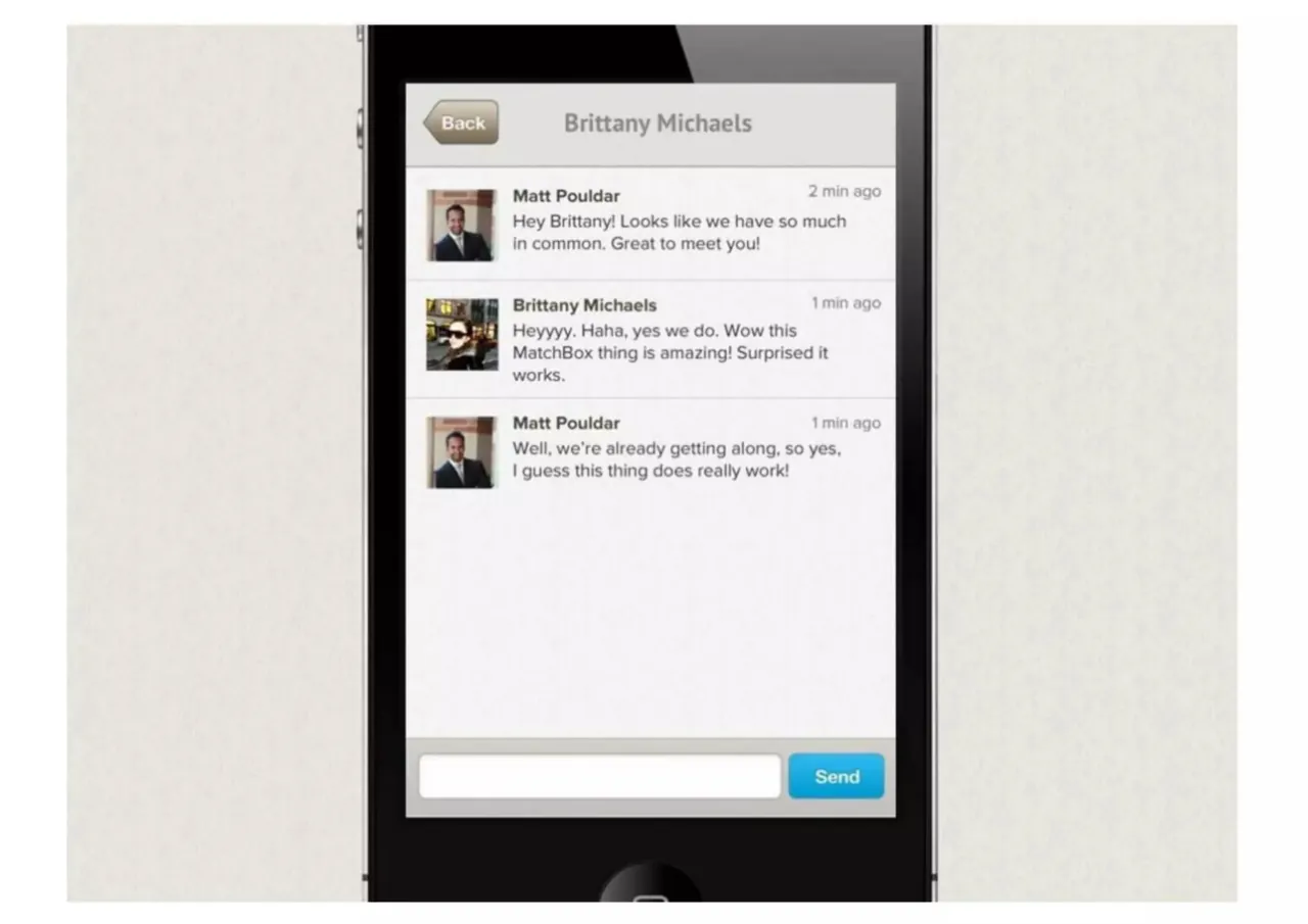
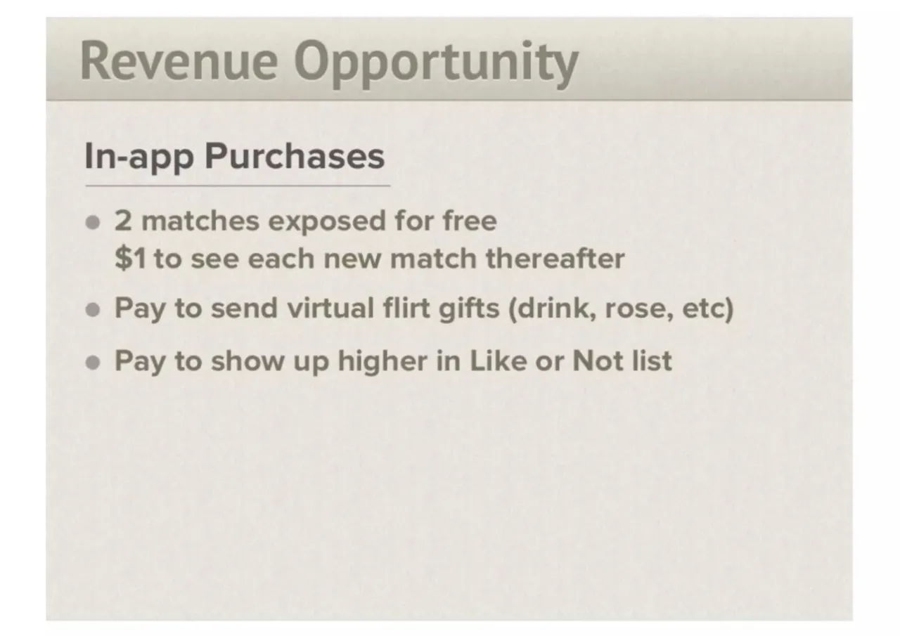
The deck opens with a title slide for Match Box, a flirting game, then tells the story of Matt, who sees someone he likes at a party but does not approach her because he fears rejection. It presents the product as the solution: users like people nearby and get connected when the feeling is mutual, with sign-in through Facebook. The middle slides walk through the core experience in sequence: a Like or Not card screen showing shared interests and friends, a matches list showing who likes you back, and a chat screen where two matched users begin talking. The next slide covers the matching signals, including hyper-location using WiFi rather than GPS, mutual liking, shared interests, and friends in common. The deck closes with a revenue slide listing in-app purchases such as two free matches, a fee to reveal each further match, paid virtual gifts, and paid placement higher in the Like or Not list. Slides 6 to 8 are the strongest for study, as they show the product flow with real screens and a short example conversation.
Review score: 7 out of 10, Effective
Presentation quality, judged with the SlideDeck Co review heuristic. Ask, evidence and idea merit are not rated here.
The story-then-product route is clear and easy to follow: Matt at the party (slides 2 to 4) sets up the fear-of-rejection problem, then slide 5 introduces the cure and slides 6 to 8 walk through Like or Not, Matches and chat using large, legible real screens. Each slide has one idea, the type is big, and the teal, red and orange palette is used consistently. The weaker back end lets it down: slides 9 and 10 switch to a gray-on-beige bullet template with low contrast, large empty lower halves and no visual, so the signals and revenue points feel flat next to the strong opening. The deck also has no close, team, market or summary slide, so it ends abruptly on a text list.
Worth keeping: Keep the Matt story sequence on slides 2 to 4 and the full-bleed phone screens on slides 6 to 8, especially the readable sample conversation on slide 8.
Most useful repair: Rebuild slides 9 and 10 with higher-contrast text, larger type filling the space, and a visual or icons for the signals and the three purchase types.
What would change the score: I would add a short closing slide that restates the value and the next step, and give slide 2 a more deliberate photo crop and treatment.
Confidence high. 10 of 10 pages inspected on contact sheets, 4 at readable size. Reviewed 2026-11-08. Model-assisted review (claude-sonnet-5-5).
Full text of the slides (10 slides)
Every slide's words and a description of its charts and images, so the deck can be searched and rebuilt. Also available as Markdown.
Slide 1
MatchBox
the flirting game...
Slide 2
Meet Matt
Visuals: One photograph, a portrait-oriented indoor snapshot of a man with short dark curly hair, a trimmed beard and a black button-up long-sleeve shirt. He stands slightly angled toward the camera with his head tilted, smiling faintly, and holds a clear plastic cup with dark red drink close to his mouth with his right hand; a dark beaded bracelet is on his wrist. Behind him are light wood built-in cabinets and shelves with books and a small black speaker on the upper shelf, a dark wall with a partly visible black party banner, and a doorway with a framed picture on the left. Lighting is warm, direct and on-camera with a slight flash look, and the dominant colours are black, warm wood beige and dark brown. The photo is a full, uncropped rectangle with square corners, boxed on the beige slide with no overlay or tint.
Slide 3
Matt spots a girl he likes at a party...
BUT, like most of us, Matt won't go over to say hello
Slide 4
He has the same problem
most of us do...
FEAR OF
REJECTION!
Slide 5
Meet the cure…
MatchBox
the flirting game…
Like people around you and
get connected if they like you too
Sign In With Facebook
Visuals: One illustration: a front-on rendering of a black smartphone (iPhone 4 style) with a silver edge, front camera and speaker grille at the top, and the lower part of the phone cut off by the bottom edge of the grey panel. The phone screen shows the app's sign-in screen: the MatchBox logo, the tagline, a blue Facebook sign-in button, and below them a grid of about ten small warm-toned, sepia-tinted photographs of people in two rows of five, cropped at the bottom. Subjects, top row, left to right: a smiling man in a brown jacket; two women under a yellow umbrella; a man in a blue shirt; a person in a bright green top with arms outstretched in a green landscape; a person in a green hooded top. Bottom row, partly visible: a blonde woman; a man in sunglasses in an urban street; a woman in a wide-brimmed hat; a woman in a blue beanie; a man partly cut off. Lighting is soft and even, and the photographs have a warm yellow-orange cast. No overlay or tint on the phone; the photographs are boxed by the screen edge.
Slide 6
Like or Not
Matches
Messages
Brittany Michaels
20 friends & 50 interests in common
Like
Not
Things In Common:
And 48 more...
Friends In Common:
And 18 more...
Visuals: Phone mockup: a black smartphone frame (about 28% to 72% of slide width, full height), shown front-on with a dark glossy bezel, a small speaker grille at the bottom and side buttons on the left edge. Screen content, all as a flat app screenshot: (1) Top tab bar, three tabs plus an avatar. 'Like or Not' tab is active with an orange fill and white thumbs-up/thumbs-down icon; 'Matches' tab has a grey rosette ribbon icon; 'Messages' tab has a grey speech-bubble icon; the far-right square shows a small photo of a man in a dark suit. (2) Profile card: a white-bordered photo of a woman in dark tinted sunglasses and a dark fur-collared coat, smiling, with dark wavy brown hair, shot as a close selfie-style crop from slightly below in daylight on a city street; background shows lit shopfronts with warm yellow windows, a white van, a yellow taxi, a pedestrian in a dark coat, and grey snowy pavement; the photo is boxed with a thin light-grey frame, not full-bleed. Name and a small teal-and-orange overlapping-circles icon are overlaid in white text on the top of the photo. (3) Two buttons: a blue 'Like' button with a white thumbs-up icon and a grey 'Not' button with a white thumbs-down icon, both with rounded corners and a slight bevel, sitting in a light-grey outlined tray. (4) 'Things In Common:' panel showing two thumbnails: a black-and-white patterned photo of a woman with a hand in her hair, and a Vogue magazine cover with the word VOGUE in blue and a blonde woman. (5) 'Friends In Common:' panel showing two small photos: a woman with long light-brown hair in a warm-toned snapshot, and a smiling man with short dark hair in a dark shirt. Lighting in the photos is natural and warm; the screen itself is evenly lit with no gradients.
Slide 7
Like or Not / Matches / Messages / People that like you back: / Brittany Michaels / 20 friends & 2 interests
Visuals: One photograph-style screenshot of a black smartphone held upright, shown straight on with no tilt. The phone screen shows the app's top tab bar with four items: a grey thumbs-up and thumbs-down icon labelled 'Like or Not', a highlighted orange tab with a white rosette icon labelled 'Matches', a grey speech-bubble icon labelled 'Messages', and a small square profile photo of a man in a dark suit at the far right. Below the tabs is the heading 'People that like you back:' over one card. The card has a square photo of a woman with dark hair and sunglasses standing on a city street lined with lit shop fronts, the name 'Brittany Michaels', a small teal and orange overlapping-circles icon followed by '20 friends & 2 interests', and a round grey chevron button at the right. The rest of the screen is empty white. The lighting is flat and even, as in a product screenshot. The phone is complete, not cropped, and sits on a plain off-white textured background with no overlay.
Slide 8
Back / Brittany Michaels
Matt Pouldar / 2 min ago
Hey Brittany! Looks like we have so much in common. Great to meet you!
Brittany Michaels / 1 min ago
Heyyyy. Haha, yes we do. Wow this MatchBox thing is amazing! Surprised it works.
Matt Pouldar / 1 min ago
Well, we're already getting along, so yes, I guess this thing does really work!
Send
Visuals: Photograph of a black smartphone mockup (rendered, front-on, slightly angled) showing a messaging app screen. The phone fills the centre of the image from top edge to bottom edge, with a home button arc visible at the bottom. Screen content: a grey header bar with a brown beige 'Back' button at upper left and the title 'Brittany Michaels' centred. Below it, three chat messages: (1) avatar of Matt Pouldar, a man in a dark suit and tie against a brick-coloured background, name and timestamp '2 min ago' followed by two lines of text; (2) avatar of Brittany Michaels, a woman in dark sunglasses in a street scene with warm yellow lights, name and timestamp '1 min ago' followed by three lines of text; (3) avatar of Matt Pouldar again, timestamp '1 min ago', two lines of text. Thin grey dividers separate the messages. Bottom bar: a white rounded text input field at left and a bright blue 'Send' button at right. Composition is front-on and centred with even margins. Lighting is flat and even, as in a studio screenshot. Dominant colours: black, light grey, off-white, beige and sky blue. Not cropped; the phone image is boxed inside the white slide with a soft off-white textured backdrop behind the phone.
Slide 9
Under the hood
NEW Signals for Relevence
Hyper-location (Using WIFI, not GPS)
Mutual liking
Social interests in common
Friends in common
Slide 10
Revenue Opportunity
In-app Purchases
• 2 matches exposed for free
$1 to see each new match thereafter
• Pay to send virtual flirt gifts (drink, rose, etc)
• Pay to show up higher in Like or Not list