
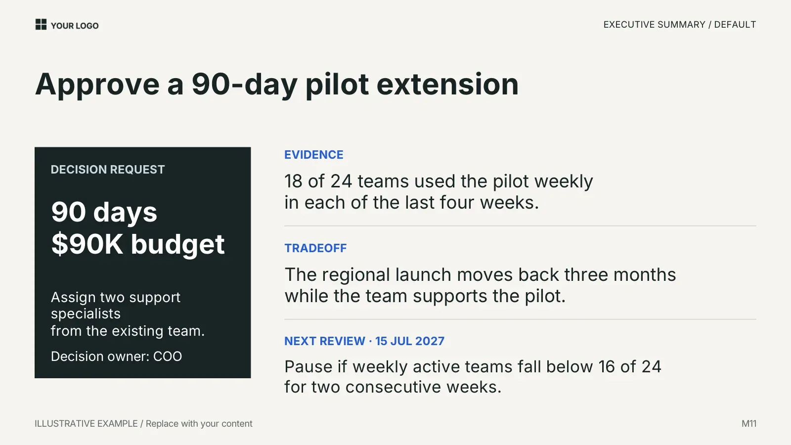
An executive summary slide has one job: let a reader who stops after one slide know what you are asking, why, and what happens next. This guide shows three versions of that slide from the Standard Deck, with the same fictional decision on each, and explains what to put where. The figures are illustrative and labeled as such on the slides.
What the slide has to carry
Four things, in this order of importance:
- The decision you want. Written as the headline, as a request or a recommendation, not as a topic. "Approve a 90-day pilot extension" tells the reader what to do. "Pilot update" does not.
- The evidence that supports it. One or two measured facts, with the denominator. "18 of 24 teams used the pilot weekly in each of the last four weeks" can be checked. "Strong engagement" cannot.
- The trade-off. What the decision costs or delays. Readers trust a summary more when it names the downside before they do.
- The next step and its trigger. When the decision is reviewed again and what would reverse it.
Everything else, including the method, the history and the alternatives you rejected, belongs on later slides or in an appendix.
Version 1: the simple summary

Use this when the room already knows the context and you need a single page to anchor a conversation. The headline is the recommendation; the one sentence under it says what the pilot will test. There is no room for evidence here, so it only works when the evidence follows on the next slide or the audience has seen it before.
Editable elements: the label, the headline and the sentence. Nothing else moves.
Version 2: the default summary
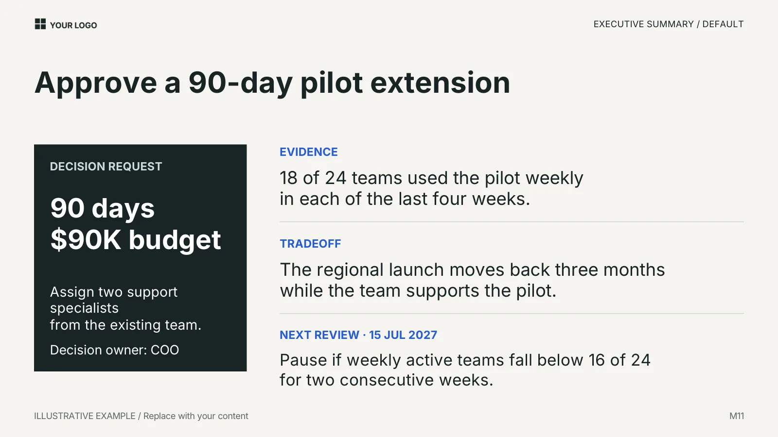
This is the version to reach for first. The left panel states the request in numbers a decision maker can approve or refuse: the duration, the budget, the people and who owns the decision. The right column gives the three supporting facts in a fixed order: evidence, trade-off, next review. The last row names the trigger that would pause the work ("below 16 of 24 for two consecutive weeks"), which is what turns a request into a decision rule.
Editable elements: every text box. The three labels on the right are text too, so you can rename "Tradeoff" to "Risk" if your organization uses that word, but keep the order. The dark panel is a shape with a fill, not an image.
A writing check for this slide: read only the bold text. If "Approve a 90-day pilot extension" and "90 days, $90K budget" are the only words a reader takes in, do they know what is being asked? They should.
Version 3: the summary with a table and a chart
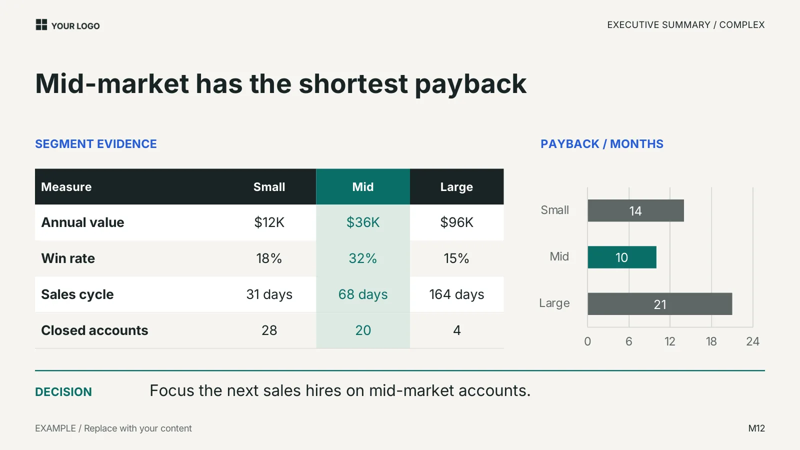
Use this when the decision rests on a comparison. The headline states the finding ("Mid-market has the shortest payback"), the table shows the measures behind it for each segment, the chart shows the one measure that decides it, and the decision line at the bottom says what follows. The reader can disagree with the decision while seeing exactly which number they would have to dispute.
Editable elements: the table cells and the chart data. The chart is a native chart, so right-click it and edit the data rather than redrawing bars. The Excel chart workbook in the package holds the same sample data, but changing the workbook does not update the slide; you edit the slide's own chart data.
Choosing between the three
| Situation | Use | Why |
|---|---|---|
| The audience knows the context and you want one anchor page | Simple (M10) | One idea, no competing facts |
| You are asking for money, time or people | Default (M11) | The request is quantified and the trigger is explicit |
| The decision depends on comparing options or segments | Complex (M12) | The reader sees the deciding measure, not just the conclusion |
Mistakes these layouts prevent, and two they do not
The layouts fix the order and the amount of text, which stops the two most common failures: a headline that names a topic instead of a decision, and a wall of bullets that leaves the reader to find the point. They do not stop two others. First, evidence without a denominator: "18 teams" means nothing without "of 24". Second, a next step with no owner or date: "Review progress" is not a next step; "Next review 15 July 2027, decision owner COO" is.
Where this comes from
The three slides are layouts M10 to M12 in the Standard Deck, which has layouts for business reviews, updates and plans. The free three-slide sample on that page includes an executive summary layout, so you can try the editing on your own content before buying anything. The structure follows the review criteria in How to review a deck: a story heading, evidence a reader can check, and a visible next step.
Guides use the SlideDeck Co decks as their examples. See the six decks.

