The deck opens with a title slide and then defines company culture as shared beliefs, values and practices, framing HubSpot's Culture Code as the operating system of the company. It then argues why culture matters for recruiting, contrasts how work has changed from past to present, and presents the seven points of the code in order: mission and metrics, solving for the customer, transparency, autonomy and ownership, people as the best perk, daring to be different, and recognising that life is short. Each principle gets its own section with short headline slides, quotes, and a few policy examples, and the deck is candid about gaps such as limited diversity and first-time managers. It closes with a recap of the seven principles, a line inviting feedback, and a thank-you slide pointing to the open discussion site. Slides worth studying include the opening definition slide, the then-and-now comparison table, and the one-idea-per-slide sequence on transparency. The deck is long, with many slides carrying a single line of text on a dark background.
Slides worth studying

Questions about this deck
How many slides does the HubSpot Culture Code deck have?
The HubSpot Culture Code deck has 128 pages according to its page count. It opens with a title slide on slide 1 and closes with a thank-you slide.
What does the HubSpot Culture Code deck say are the seven principles of the culture code?
Slide 23 lists the seven points of The HubSpot Culture Code in order, starting with 'We are maniacal about our mission and our metrics.' The seventh point is 'We constantly question the status quo.'
What does the HubSpot culture deck say about recruiting?
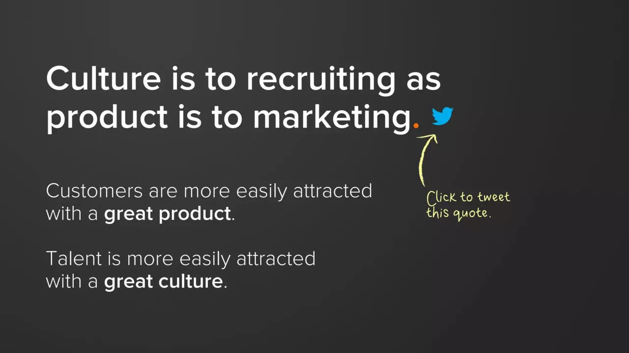
Slide 5 says 'Culture is to recruiting as product is to marketing.' It adds that talent is more easily attracted with a great culture.
What does the HubSpot Culture Code deck say about transparency?
Slide 48 states 'We share (almost) everything' and says the company makes uncommon amounts of information available to everyone in the company. Slide 49 says information is protected only when it is legally required or not completely ours to share.
Details
More from HubSpot
All HubSpot decks in the library
Review score: 8 out of 10, Strong
Presentation quality, judged with the SlideDeck Co review heuristic. Ask, evidence and idea merit are not rated here.
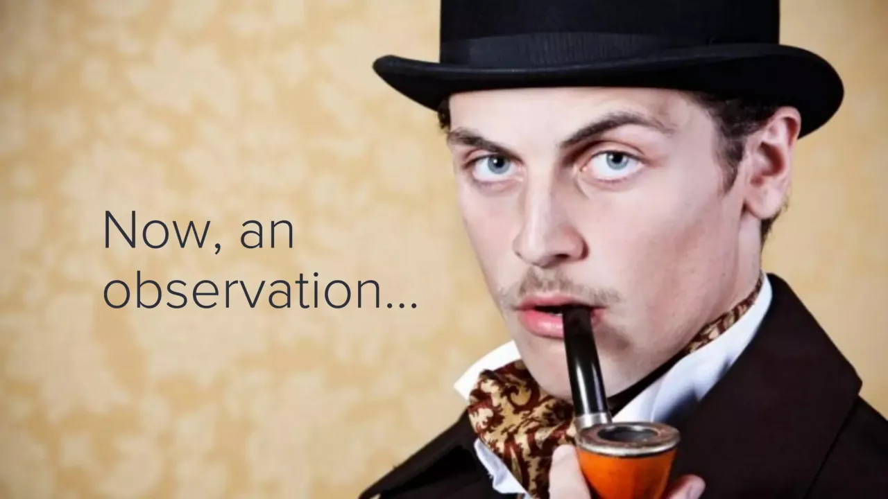
The deck holds a consistent system across the pages I saw: a dark charcoal ground, an orange accent period, bold-versus-light weight to mark the key word, and large numerals (slides 14, 33, 45, 55) that signal each of the seven sections. One idea per slide, with real headline hierarchy (slides 6, 12, 36, 59), makes the argument easy to follow and remember, and the then-and-now table on slide 12 is clean and scannable. Weaknesses are uneven stock imagery (the pipe man on slide 10, the frozen text on slide 14, the grimacing face on slide 29), a few photo slides with weak text contrast or crowding (slide 3's text box over busy code, slide 63 text on the book image, slide 72's brown text on a map), and small text on slide 51 and the wiki screenshot on slide 50. The deck is long at 128 pages and the setting is probably self-paced reading, so the sparse single-line pages work but repeat.
Worth keeping: Keep the numbered section openers, the bold-versus-light emphasis with the orange full stop, and the handwritten yellow annotations that add a candid voice.
Most useful repair: Fix the low-contrast or cramped photo-text slides (3, 29, 62, 72) and enlarge or crop the wiki screenshot on slide 50 so it can be read.
What would change the score: I would replace the generic or off-tone stock photos (10, 14, 29) with HubSpot's own team imagery as on slide 17 and trim near-duplicate build slides such as 5 and 6, 31 and 32, and 34 and 35.
Confidence medium. 72 of 128 pages inspected on contact sheets, 4 at readable size. Reviewed 2026-11-08. Model-assisted review (claude-sonnet-5-5).
Full text of the slides (128 slides)
Every slide's words and a description of its charts and images, so the deck can be searched and rebuilt. Also available as Markdown.
Slide 1
THE HubSpot
CULTURE
CODE
Creating a company we love.
v17.14.07.04
Visuals: Logo: the HubSpot wordmark 'THE HubSpot' in white sans-serif capitals and lowercase with the orange sprocket icon replacing the 'o' in HubSpot, at top centre-right (about x 36%, y 8%, w 30%, h 10%). Illustration: a glossy orange heart with a soft highlight on its upper-left lobe, shading to deeper orange-red at the lower right, centred at about x 3% to 27%, y 31% to 69%, unboxed and not cropped, sitting on the dark background with no shadow.
Slide 2
WHAT'S CULTURE?
A set of shared beliefs,
values and practices.
Slide 3
Our culture code
is the operating system
that powers our organization.
Visuals: One photographic illustration full-bleed behind everything: a grayscale digital background of hexadecimal characters (0-9, A-F, in a slab-serif typewriter style) set in irregular dark and light tiles. Overlaid on the left is a large white-to-grey silhouette of a human head in profile facing right, its head top at about 35% of slide height and its chin cropped at the bottom edge, filled with the same hex characters at lower contrast. Inside the head are three interlocking cog gears in near-black with light-grey hubs: a small gear at upper centre, a medium gear at lower left and a medium gear at centre right; the gears overlap the head outline. Lighting is even and high-contrast, with the head brightest in the centre and the background fading to black at the top and edges. Composition is landscape 16:9, full-bleed, not boxed, with no tint other than the dark translucent band behind the text.
Slide 4
WHY CARE ABOUT / CULTURE?
Slide 5
Culture is to recruiting as / product is to marketing.
Customers are more easily attracted / with a great product.
Talent is more easily attracted / with a great culture.
Visuals: One small Twitter bird logo in bright blue (#1DA1F2) sits to the right of the headline's final full stop, on the end of the second headline line. No photographs, charts or other graphics.
Slide 6
Culture is to recruiting as
product is to marketing.
Customers are more easily attracted
with a great product.
Talent is more easily attracted
with a great culture.
Click to tweet
this quote.
Visuals: One Twitter bird icon, solid blue (#1DA1F2), placed inline at the end of the title's second line, facing right, about 3.6% of slide width. One small orange period (#E8531E) after 'marketing.' in the title. One hand-drawn yellow curved arrow (#F3EE8A, rough marker-pencil stroke, about 2-3 px wide at this scale) rising from below the callout up to the Twitter bird, with an open arrowhead at the top pointing up and slightly right. No photographs, charts, or diagrams.
Slide 7
A great culture helps / people deliver / their best work.
Slide 8
CULTURE HAPPENS.
Whether planned or not,
all companies have a culture.
Why not create a culture we love?
Slide 9
“
Lets make the company we always dreamed of. Lets create a company that will be a great place to be from.
REED HASTINGS & PATTY MCCORD
NETFLIX
Visuals: A large grey opening double quotation mark (serif-free bold sans-style glyph, two comma-like shapes) in the upper-left, cropped by the top edge of the slide. A small rectangular Netflix logo: red box (#E50914-like, approximately #E83A2A) with the white wordmark NETFLIX in a condensed, shadowed, black-outlined typeface. No charts, photographs or other graphics.
Slide 10
Now, an / observation...
Visuals: Full-bleed photograph of a man in a black top hat, dark brown coat, white collar and brown paisley cravat, holding a curved black-stemmed pipe with an orange-brown bowl in his right hand near his mouth. He looks sideways toward the camera with pale blue eyes, raised eyebrows and a thin moustache. Composition: head and shoulders cropped at the top and bottom edges, subject placed right of centre (about 42% to 97% x), filling most of the height. Lighting: soft, even studio light on the face. Dominant colours: ochre-yellow mottled wallpaper background, black hat and coat, warm brown and gold cravat, orange pipe bowl, pale skin tones. No overlay or tint; photograph is full-bleed, not boxed.
Slide 11
PEOPLE HAVE
DRAMATICALLY
CHANGED HOW THEY
LIVE AND WORK.
1
Slide 12
THEN / NOW / FOCUS / Pension / Purpose / NEED / Good / Boss / Great / Colleagues / HOURS / 9-5 / Whenever / WORKPLACE / Office / Wherever / TENURE / Whole Career / Whatever
Visuals: A table with three columns (unlabelled row-header column, THEN, NOW) and five data rows plus a header row. Header row: THEN, NOW. Row 1: FOCUS | Pension | Purpose. Row 2: NEED | Good Boss | Great Colleagues. Row 3: HOURS | 9-5 | Whenever. Row 4: WORKPLACE | Office | Wherever. Row 5: TENURE | Whole Career | Whatever. Rules are thin white lines about 2px wide at 1125px slide height; no fills or highlighted cells.
Slide 13
And though people have / dramatically changed...
Slide 14
Many organizations / operate as if they're / FROZEN / in time.
Visuals: One decorative graphic: the word FROZEN rendered as a stylised 3D lettering with white and pale-cyan glossy letters, icy spiky dark-teal/black outline and spiky frost-like spikes radiating outward, centred between the second and third lines of text. Lettering is white with teal-black shading and speckled texture. Background is a frosted-window style illustration of pale blue ice with white frost crystals along the edges, behind everything.
Slide 15
They operate as if money
is what matters most...
Slide 16
... and amazing people / are happy to just / have a job.
1
Slide 17
Paychecks matter,
but purpose matters more.
(as do the people we work with)
Visuals: Full-bleed photograph of a deep-space night sky filling the whole slide: a dense field of small white and pale-blue stars over a glowing blue nebula. The brightest blue haze runs across the middle-left, with a darker navy band at the top and right. Stars are sharp points of white and light blue with a few brighter bluish flares, roughly centre-left and near the centre top. Full-bleed, uncropped, no overlay or tint, no border.
Slide 18
We dare to be different.
Visuals: Full-bleed group photograph of about 45 people in costumes posing indoors in an office lobby. They kneel, sit and stand in rows, with a brick wall and a white HubSpot sign behind them. Notable costumes include a man in a dark suit with a grey mask, a person in a silver bucket helmet, a red-haired pirate woman with a sword, a woman in a Patriots No. 12 jersey, a woman in a Hulk Hogan style yellow tank top, a woman in a white penguin costume with a red bow tie, a person draped as the Statue of Liberty in a grey-green gown, a witch in a black hat, a Riddler-style green hat, and a baby held on a woman's lap. A HubSpot logo appears on the white sign in the background, on a wall-mounted panel at the right, and on an orange wall at the far right. Lighting is warm indoor light with a bright ceiling and tiled floor, and the floor is a light wood parquet. Dominant colours are red brick, orange, yellow, white and warm brown. The photo is uncropped in a landscape frame, with the subjects centred and the floor in the lower third providing space for the headline. There is no tint or overlay, but the headline has a soft dark drop shadow.
Slide 19
We are HubSpot.
2
Visuals: One logo: the HubSpot sprocket mark, drawn at left-centre. It has a bold orange ring with a hollow centre, a short spoke to the top-right ending in a circle, a longer spoke to the upper-left ending in a circle, and a short spoke to the lower-left ending in a circle. The spokes join the ring and the circles are the endpoints. The fill is an orange gradient from light orange at the top-left (about #F9A23B) to deeper orange at the lower-right (about #F0622A). No photograph, chart or other illustration is present.
Slide 20
Out goal is not to / maintain a startup culture. / It’s to cultivate a culture that / helps us achieve our ambitions.
Slide 21
This document is
part manifesto and
part employee handbook.
It’s part who we are and
part who we aspire to be.
Slide 22
This document is
part manifesto and
part employee handbook.
It’s part who we are and
part who we aspire to be.
When something is
aspirational (not yet true)
we try to call that out.
Visuals: Two hand-drawn yellow marks, no photographs or charts. (1) A straight, slightly tapered yellow underline runs beneath 'who we aspire to be.' from about x 39% to x 76% at about y 58.5%, roughly 0.5% of slide height thick, with brush-like ends. (2) A curved, hand-drawn yellow arrow with a rough, marker-like stroke starts near the lower right of the handwritten annotation (about x 59%, y 71%) and curves up and left to a pointed arrowhead at about x 49%, y 63.5%, pointing at the start of the underlined phrase. Arrow stroke about 0.6% of slide height thick. Both marks are a pale yellow, about #F2EC7E.
Slide 23
THE HUBSPOT CULTURE CODE
1. We are maniacal about our mission and our metrics.
2. We strive to Solve For The Customer.
3. We are radically transparent.
4. We believe in autonomy not autocracy.
5. We are unreasonably picky about our people.
6. We invest in individual mastery and market value.
7. We constantly question the status quo.
Slide 24
1 / We are maniacal / about our / mission and our / metrics.
Visuals: A large orange numeral '1' in a bold geometric sans-serif (Futura-like), filled solid orange #FF6F00 with no outline, no shadow, spanning roughly y 18% to 97% of height. It is a single glyph, not a photograph or chart. The orange full stop after 'metrics' is the same orange, #FF6F00, and is a small dot at the baseline.
Slide 25
"Pursue something so important that even if you fail, the world is better off with you having tried." / TIM O'REILLY. / Note: The O'Reilly Library at HubSpot is named after Tim.
Visuals: One photograph of an older man with tousled grey-brown hair, smiling faintly and looking off to the right, wearing a dark textured jacket. He is framed from the chest up, slightly off-centre to the right, against a pale overcast sky with dark tree line at the bottom edge. Lighting is soft and diffuse, dominant colours are grey, cream and muted brown. The photo is a rectangular box, not cropped to a shape, with sharp square corners and no border. One small Twitter bird logo in bright blue (#1DA1F2) sits immediately after the closing quotation mark of the quote.
Slide 26
OUR MISSION is to
make the world INBOUND.
We want to transform
how organizations
attract, engage and delight
their customers.
Slide 27
inbound / is about empathy. / It's about creating / an experience / people love.
Visuals: Photograph of a red heart-shaped wooden or ceramic ornament with a white border, hung on an orange-red cord with a small red bead at the top left, lying on weathered dark brown wooden planks. The heart occupies the left third of the frame, its point facing down-right, with the cord running up and left to the bead near the top-left corner. Lighting is soft and even, natural daylight from above. Dominant colours are saturated red, white, and dark brown-grey wood. The photograph is full-bleed, uncropped, with no overlay or tint.
Slide 28
WE BELIEVE OURS / IS A NOBLE CAUSE.
We help organizations grow.
Slide 29
And, we reduce the / amount of spam, / junk mail and other / interruptions and / annoyances.
Visuals: One full-bleed photograph of a man's head and shoulders, shot close-up with the face turned toward the camera and slightly to the right. He has a fierce scowl with narrowed eyes, furrowed brow, wrinkled nose and tightly pressed lips. He has short dark brown hair and wears a black jacket with a green hood or collar visible at the lower left. The photograph is cropped at the top and bottom, with the head running off the upper edge. Lighting is soft and frontal with a light falloff to the left. The dominant colours are light grey (left background), skin tones, black and green. No overlay or tint is visible.
Slide 30
Our commitment to our mission has earned / us the love of many. / / Our commitment to our metrics has earned / us the resources to further our mission. / / We are passionate about both.
Slide 31
Balancing this dual personality / of mission & metrics is challenging.
But it's also partly what makes us / DIFFERENT.
Slide 32
Balancing this dual personality / of mission & metrics is challenging.
But it's also partly what makes us
DIFFERENT.
And sometimes / dysfunctional.
Visuals: Two hand-drawn annotations on the slide: a pale yellow (#FFF59D-like) hand-drawn underline stroke about 1.5% of height thick running beneath the word DIFFERENT from about x 13% to x 44%, at about y 71%; and a thin yellow hand-drawn curved arrow pointing left, from about x 53% at y 74% toward a small orange period at about x 44%, y 68%. The handwritten note 'And sometimes / dysfunctional.' is in the same yellow. A small orange dot (#E8731E-like) forms the period after DIFFERENT. No photographs, charts or logos.
Slide 33
2 / We Work To / Solve For The / Customer.
Visuals: A large bold numeral '2' in saturated orange, roughly 79% of slide height, set in a geometric sans-serif (Futura or Gotham-like) with a flat, solid fill and no outline or shadow. It is not cropped. The period after 'Customer' is also orange, matching the numeral. No photographs, charts, icons or logos.
Slide 34
SFTC.
Solve for the customer
Not just their delightion,
but also their success.
Visuals: A Twitter bird logo in bright sky blue (#1DA1F2) at about 47.5% x, 88% y, roughly 4.5% of slide width by 7.5% of slide height. Its shape is the standard Twitter bird, a solid flat silhouette with no outline or shadow. No photographs, charts, or other illustrations. An orange dot (#FF6600) follows the final C of the wordmark, as a period.
Slide 35
SFTC.
Solve for the customer
Not just their delightion,
but also their success.
Delightion is not a word,
but it should be.
Visuals: A Twitter bird logo in bright blue (about #1DA1F2) centred horizontally at about 48% from the left and 88% from the top, roughly 4% of slide width. A hand-drawn curved arrow in pale yellow (about #F5F07A) runs from the annotation text leftward and ends in an arrowhead just right of the comma after 'delightion', about 1.5% stroke width. A single solid orange dot (about #FF6A13) forms the full stop after SFTC. No photographs or charts.
Slide 36
IT’S BETTER TO OBSESS OVER
CUSTOMERS
THAN COMPETITORS.
Slide 37
“ / Have the courage to start with the customer. My biggest regrets are the moments that I let a lack of data override my intuition on what’s best for our customers. / ANDREW MASON. / FORMER CEO OF GROUPON / IN HIS DEPARTURE EMAIL
Visuals: One large grey opening quotation mark (filled #8A8A8A, sans-serif bold glyph) cropped by the top edge, spanning about x 11–36%, y 0–29%. One Twitter bird logo in bright blue #1DA1F2, about 5.5% wide and 4.5% high, placed to the right of 'customers.' at about x 55%, y 60%. No photographs or charts.
Slide 38
FOR EVERY DECISION / WE SHOULD ASK / OURSELVES:
“Selves, what’s in it for / the customer?”
Slide 39
WAIT. Does “Solve For The Customer” / mean just giving more away for free? / Wouldn’t that delight customers? / NO. To delight customers in the / long-term, we have to survive in the / short-term. / Because...
Slide 40
Bankrupt companies / don't delight / their customers.
Slide 41
We have a professional sales team.
Does hitting our sales goals support
our long-term mission?
Slide 42
YES.
Having delighted customers requires having customers (funny how that works).
We’re on the right path as long as we sell to customers that we expect to delight.
Slide 43
YES – WITH ONE CAVEAT.
Having delighted customers requires having customers (funny how that works).
We’re on the right path as long as we sell to customers that we expect to delight.
This is the key. We shouldn’t sell customers we’re not justifiably confident we can delight.
Visuals: A hand-drawn yellow underline runs beneath the phrase 'expect to delight.' spanning roughly x 37.5% to 64.5%, at about y 61.5%. A hand-drawn yellow curved arrow starts near the annotation at about x 61.5%, y 66% and curves up-left, ending with an arrowhead at about x 53%, y 65.5%, pointing at the underlined phrase. No photographs, charts or logos.
Slide 44
WE LOVE TO TEACH.
We believe success comes through educating people, not exploiting them.
Slide 45
3
We are
radically and
remarkably
transparent.
Visuals: One large orange numeral '3' in a geometric sans-serif bold, solid orange fill, spanning roughly from y 18% to y 99% of the slide height and x 11% to 41% of the width. No photograph, chart, icon or logo. Lighting is flat; the background has a subtle radial lightening toward the upper left.
Slide 46
Today, power is gained / by sharing knowledge, / not hoarding it.
Visuals: One logo: the blue Twitter bird, centred horizontally at about 47.7% to 52.3% of slide width and about 87.8% to 94.9% of slide height, solid #1DA1F2 fill with no outline, no shadow.
Slide 47
“Sunlight is the / best disinfectant.” / -LOUIS BRANDEIS
Visuals: Illustration: a stylised sun, centred at about x 24%, y 39%, with a pale cream-yellow circular disc (about #FFF3B0 to #F9DC7A with a soft concentric ring highlight) surrounded by a ring of spiky flame-like rays in red-orange (#C8322A to #E8642A) with darker red outlines and cream highlights. The rays extend radially to a diameter of about 30% of slide width. Behind the sun and across the whole slide is a decorative swirl pattern of pale yellow and light orange curved bands, leaf-like brush strokes and thin concentric arcs, lower contrast on the left and denser, thin curved lines on the right. Lighting is flat and even, with a slight glow around the sun. No photograph, chart, table or logo.
Slide 48
WE SHARE (ALMOST)
EVERYTHING.
We make uncommon amounts of
information available to
everyone in the company.
(there are now 700+ HubSpotters)
Slide 49
We protect information only when:
It is legally required.
Example: Information covered under a
Non-Disclosure Agreement (NDA)
It is not completely ours to share.
Example: Individual compensation data
Slide 50
WE HAVE THE MOST INTERESTING / WIKI ON THE PLANET.* / Examples of things we share and discuss: / Financials (cash balance, burn-rate, P&L, etc.) / Board meeting deck / Management meeting deck / “Strategic” topics / HubSpot Lore & Mythology (the funniest page on the wiki) / *Unverified claim
Slide 51
FROM / HubSpot Lore & Mythology 2007 Archive / June - July 2007 / At some point around this time, Brian's favorite line from Mike Volpe was uttered... / Brian: "Isn't there like a scientific way to figure out all this branding stuff?" / Mike: "Welcome to Marketing. Two drink minimum." / 7/12/07 - Dharmesh: "The technical reason is that we had a big database 'owie'" (explaining why the product has not been working) / 6/6/07 - Brian: *"I am a landing page master!" (after building one landing page in 20 minutes with the first rev of the landing page builder) / 6/6/07 - Ilya Mirman: "Holy shit! That's fucking awesome!" (upon finding out he had 7 RSS subscribers after writing one blog article) / 6/4/07 - Partner at GC during VC meeting: "So, where are you in the fundraising process?" Brian: "The end." / Notes: / Mike Volpe: Our CMO (been here since the beginning) / Ilya: An early customer / GC: General Catalyst Partners (VC that led our Series A funding)
Visuals: One screenshot of a wiki page, placed as a full-width white rectangle with black Arial-style text on white. It contains a bold heading 'June - July 2007' and a nested bullet list of eight entries: a bullet for the 'At some point' line with two sub-bullets for Brian and Mike, then four bullets for 7/12/07 Dharmesh, 6/6/07 Brian, 6/6/07 Ilya Mirman, and 6/4/07 Partner at GC. Bold is used for the quoted lines. Next to the title is a white rectangle holding the HubSpot Wiki logo: an orange sprocket icon with the wordmark 'HubSpot' in grey-blue, and the small word 'Wiki' beneath it, followed by the text 'HubSpot Lore & Mythology 2007 Archive' in blue. No charts, tables or photographs.
Speaker notes: Notes: / Mike Volpe: Our CMO (been here since the beginning) / Ilya: An early customer / GC: General Catalyst Partners (VC that led our Series A funding)
Slide 52
We have open access to anyone in the company.
It's not an open door policy.
It's a no door policy.
Visuals: One photograph of a retail-style sign, boxed with a thin white border, reading 'Come in We're OPEN'. The sign is a red rectangle with rounded corners; 'Come in' is in white italic script with a swash under it, 'We're' is in white bold sans-serif capitals at the top right, and 'OPEN' is in large white bold condensed sans-serif capitals filling the lower part. The photo is shown straight-on, framed as a rectangle with a white margin about 1.5% of slide width, not cropped, not full-bleed. Lighting is flat and even; dominant colours are red #D90000 and white #FFFFFF.
Slide 53
SEATING HACK.
A large part of the company goes through a semi-random "seat shuffle" every 3 months.
We've been doing this since the beginning.
It reflects our "change is constant" credo.
It also circumvents a lot of needless politics.
(we hate politics with the heat of a thousand suns)
Slide 54
The intent behind all this transparency is to support smarter behavior and better decisions.
So...
Slide 55
4
We give / ourselves the / autonomy to / be awesome.
Slide 56
WE TRUST
OURSELVES.
6
Slide 57
Just because someone made a mistake years
ago doesn’t mean we need a policy.
WE DON’T PENALIZE THE MANY
FOR THE MISTAKES OF THE FEW.
We only protect against big stuff.
Visuals: One Twitter bird logo, solid blue (#1DA1F2), filled, centred horizontally at about 48% across and about 88% down the slide, roughly 4.6% of slide width. No photographs, charts, or other graphics.
Slide 58
We don't have / pages of policies / and procedures.
Visuals: Photograph of a human hand (thumb and fingers visible, skin tone light tan) pressing down on the fanned edge of a stack of white magazine or paper pages. The stack sits on the left side of the frame and runs off the left and bottom edges, so it is cropped. The thumb is the dominant foreground element, angled from upper left toward lower centre. Lighting is soft and warm, natural daylight. Dominant colours: orange-amber background (#D9901A to #E8A33A), white and pale grey paper edges, peach skin tone. The background behind the text is a soft, out-of-focus amber wall with a lighter tan surface at the bottom. No overlay is visible other than a slight warm tint over the whole image.
Slide 59
Instead we have a 3-word policy on / just about everything: / USE / GOOD / JUDGMENT.
Slide 60
Social media policy.
Travel policy.
Sick day policy.
Buy a round of drinks at an event policy.
Work from home during a blizzard policy.
Our policy on all of these (and most other) things:
USE GOOD JUDGMENT.
Slide 61
WHAT IS GOOD
JUDGMENT?
This book does not yet
exist. But it should.
Visuals: One photograph-style illustration of a parody book cover, tilted about 8 degrees clockwise and placed on top of the dark background, with a thin white border. Cover content from top: a yellow band with green text 'Best way to learn good judgment'; a black band with large white bold sans-serif 'Brilliantly Bad Judgment' over the word 'FOR' in small yellow serif and 'DUMMIES' in large yellow distressed hand-lettered type; a teal divider line; a lower yellow area with teal bold text 'A Reference for the Rest of Us!' at left, a teal speech bubble at right reading 'Hilarious, (mostly) hypothetical examples!' in white, a cartoon man with round glasses, spiky black hair and a pencil at lower right, and black bold text 'By: The HubSpot Team' at bottom left. The cover is cropped at the bottom edge of the slide. Lighting is flat and even; dominant colours are yellow, black, teal and white.
Slide 62
Here’s the cheat sheet on good judgment:
customer > company > self
Slide 63
company > self
Don’t solve for your personal interests at / the expense of the company.
Be a team player, / not a politician.
Slide 64
customer > company
Don’t solve for the company’s interest at the expense of the customer .
Solving for customers’ interest is in our long-term interest.
Slide 65
Results matter more than / the hours we work.
Visuals: Photograph: a man's arms and hands, seen from the front, with his forearms resting on a wooden table surface at the bottom of the frame. He holds a large grey wall clock in both hands in front of his face, so only the clock face is visible. The clock shows about 12:10 with the hour hand near 12, the minute hand near 2 (about 10 minutes) and a thin red second hand near 1. Clock numerals are dark grey bold sans-serif with small tick dots. Sleeves are striped in red, orange, white and dark brown. Lighting is soft and diffuse from the front. Dominant colours are light grey wall, grey clock, warm tan skin and brown table. The photo is full-bleed along the bottom and extends to the left and right edges, cropped at the bottom of the clock rim. No overlay or tint.
Slide 66
Results matter / more than where / we produce them.
Visuals: One photograph, full-bleed, uncropped at the edges. It shows a blurred close view of a lit fireplace: bright orange and white flames rise in the upper centre and right, glowing embers and dark logs sit below them, and a dark brick or stone hearth frames the right side. In the lower right, a cream or off-white ceramic mug filled with dark coffee sits on a warm orange-brown wooden surface. In the lower left and left-centre, a black laptop screen is shown head-on, its top edge at about 17% of the slide height and its right edge at about 50% of the slide width, cutting into the photo; its bezel is dark grey and it has no visible content. Lighting is warm and low-key, from the fire, with the left side in shadow. Dominant colours are black, deep brown, burnt orange, amber and cream. The image is soft-focus and slightly low resolution. No overlay or tint is visible other than the natural darkness of the scene.
Slide 67
Results matter more / than how much / vacation we take. / (we don't monitor vacation time)
Visuals: Full-bleed photograph of a swimming pool: a curved white coping edge runs from the left-centre down toward the bottom, bordered on the left by warm brown-and-tan square travertine-style paving tiles and on the right by a band of small blue mosaic tiles that curves toward the bottom centre. The water is deep saturated blue with light rippling across the surface; a small, faint swimmer or object is visible near the centre-right at about 57% x, 69% y. Camera is above the pool edge looking down at an angle, with the curve sweeping from upper-left to bottom. Lighting is bright daylight with strong blue and warm brown contrast. Dominant colours: royal blue #1E56A0 and deep navy #0A2A6B in the water, cream white #F4F1E8 coping, tan-brown #8A5A2B paving. Photograph is not cropped beyond full bleed and has no overlay or tint.
Slide 68
WE LOVE DATA.
We like for our decisions to be
insight-driven and data-powered.
Slide 69
DEBATES SHOULD BE / WON BY BETTER DATA / NOT BIGGER JOB TITLES. / We disfavor pulling rank. / It happens. / But we don't like it.
Visuals: One hand-drawn style curved arrow in pale yellow, starting near the lower-right annotation and curving up and left to point at the end of the subline 'We disfavor pulling rank.' The arrow has an open arrowhead with two short strokes. No charts, photographs or logos.
Slide 70
INFLUENCE / SHOULD BE / INDEPENDENT OF / HIERARCHY. / (Twitter bird logo, no text)
Visuals: One logo: the Twitter bird, a solid light-blue bird silhouette facing right, sitting at the bottom centre-right of the slide. No photographs, charts, or diagrams. The orange full stop after HIERARCHY is part of the headline text, not a separate shape.
Slide 71
CEO, VP of This,
Manager of That.
Doesn’t matter what
your title is.
EVERYBODY
DOES REAL
WORK AND
GETS THEIR
HANDS DIRTY.
Visuals: Full-bleed photograph of a wooden surface (light tan plywood or pine grain running diagonally) with a collection of hand tools filling the right 40% of the frame, cropped at the right and bottom edges. Tools, from top to bottom: a rusted, dusty adjustable wrench jaw at top right with a serrated jaw, a long steel screwdriver shaft running diagonally from top centre to lower right, a small flat-blade screwdriver with a black and yellow handle at right edge, a pair of silver-chrome pliers/cutters with a bolt-pivot in the lower centre-right, and a red-orange plastic-handled screwdriver at bottom right. Lighting is soft and even, daylight-like, from the upper left. Dominant colours are tan/caramel wood, silver-grey metal, rust brown, red-orange and yellow. Image is not boxed; no overlay or tint on the tools. The wood ground is subtly lightened behind the text, with no added panel.
Slide 72
People want / direction on where / they are going... / NOT / micro-directions on / how to get there. / h/t Simon Sinek
Visuals: One photograph of an old hand-drawn treasure map on aged, yellowed parchment, shown full-bleed. The top edge of the parchment is torn and curled against a dark reddish-brown wooden surface at the top of the frame. The map shows a compass rose with an N and an upward arrow at the upper left, a large X mark at the lower centre, coastline outlines, a small palm-tree cluster, ship sketches, and faint handwritten labels, all in dark graphite-grey ink. Lighting is warm and directional, brighter in the centre and darker toward the top and right edges, with vignetting. Framing is close and cropped so that the parchment edges are visible at top and right. The photograph has a warm sepia tint and a slight darkening overlay behind the text to aid legibility.
Slide 73
With this kind of / transparency and trust / we shouldn’t take chances / when hiring. So…
Visuals: One photograph of a roulette wheel, seen from a low angle, with the spindle and top cone cropped by the top edge of the slide. The wheel occupies roughly the upper 48% of the slide and is centred slightly right of middle. The wheel has a mahogany-red wooden rim and bowl, a silver-chrome spindle with a cone, a ring of red, black and green numbered pockets (visible numbers include 28, 12, 0, 32, 15, 19, 4, 21, 2, 25, 17, 34, 29, 7, 18, 9, 31, 14, 20, 1, 26) and a white ball resting near the green 0 pocket. Lighting is a soft spotlight from above, and the outer rim fades to black. Dominant colours are black #000000, deep red-brown #7A1E12, and bright red #C8102E with green #1E8B3A on the zero pocket. The photo is not boxed; it blends into the black background with no border, overlay or tint.
Slide 74
5
We are
unreasonably
picky about our
people.
Visuals: Large solid orange numeral 5 in a geometric sans-serif bold form, filled flat orange #F97306 with no outline or shadow, about 80% of slide height tall. No photograph, chart or icon. A small orange full stop follows the word 'people' in the same orange as the numeral.
Slide 75
peers >> beers
Quality of peers is much more important than quantity of beers.
Visuals: Photograph of two pilsner glasses of pale golden beer with thick white foam heads, the taller glass in front and a second glass behind it at the far left edge, cropped by the frame. Beads of carbonation are visible on the glass surfaces. Lighting is warm and directional, with highlights on the glass edges. Dominant colours are amber, gold, and deep brown; the background is a blurred brown surface with darker vignetting toward the top right. The photo is full-bleed with no border, and a brown tint darkens the right side behind the text.
Slide 76
What makes someone / a great fit for HubSpot? / What makes them awesome for us? / What does it mean to be / HUBSPOTTY?
Visuals: One logo: the HubSpot sprocket mark in orange, at the bottom-right corner, partially cropped by the right and bottom slide edges. It consists of a large open ring with a short stem extending upward to a small circle at top, a stem extending up-left to a larger circle, and a stem extending down-left toward the bottom edge, all in orange gradient from #FF7A1A to #F26A10. No photographs, charts, or diagrams.
Slide 77
There are 5 attributes
that we value in people.
Slide 78
HUMBLE.
Self-aware and respectful.
Visuals: One icon: a solid orange heart with a subtle vertical gradient, lighter orange (#FF9A2E) at the top to deeper orange (#E8600F) at the bottom, with soft rounded lobes and a pointed base. It sits to the left of the wordmark, with no outline or shadow. No photographs, charts or other graphics.
Slide 79
Wait. Doesn't being humble mean / lacking confidence? / No. / The very best people are self-aware / and self-critical – not arrogant. / Examples: Bezos. Buffett. Berners-Lee. / (and that's just some of the Bs)
Slide 80
“ / Humility is not thinking less of yourself; it is thinking of yourself less. / C.S. LEWIS.
Visuals: A large grey opening double quotation mark (sans-serif, rounded form, colour about #8C8C8C) positioned top-left, cropped by the top edge of the slide, spanning roughly x 11% to 36%, y 0% to 29%. No photographs, charts, or logos.
Slide 81
When things go well, humble / people tend to / share the credit. / When things go poorly, / they tend to / shoulder the responsibility.
Visuals: One logo: the Twitter bird, solid bright blue (#1DA1F2), roughly centred horizontally at about 48% to 52% of the width and placed near the bottom at about 88% to 95% of the height, approximately 4.5% of the slide width in size. No photographs, charts or other graphics.
Slide 82
EFFECTIVE.
GSD (Gets stuff done)
Measurably moves the needle.
Immeasurably adds value.
Visuals: One orange heart icon, solid with a subtle top-left highlight and a slight gradient from light orange at the top to deeper orange at the bottom, placed immediately left of the word EFFECTIVE. An orange period dot follows the final E of the heading. No photographs, charts or diagrams.
Slide 83
EFFECTIVE PEOPLE:
Predisposed to action.
They just do things.
Have a sense of ownership.
Are resourceful and always
looking for leverage.
Slide 84
ADAPTABLE.
Curious and constantly changing.
Life-long learner.
Visuals: One icon: a solid orange heart (gradient from light orange #FF9A2A at top-left to deeper orange #E8610F at bottom-right, glossy, no outline) located at the left of the headline, about 8% wide and 9% tall, sitting at the cap height of ADAPTABLE. The orange heart is the only graphic; no photographs, charts or diagrams. The period after ADAPTABLE is a small orange dot of the same orange as the heart.
Slide 85
REMARK·ABLE.
worthy of being remarked upon*
Has a super-power that makes them stand out in some way.
Remarkably smart.
Remarkably creative.
Remarkably resourceful.
*h/t to Seth Godin
Visuals: One heart icon: a glossy orange heart with a lighter top-left highlight and a darker orange lower-right edge, placed to the left of the wordmark, about 11% of slide width. A small orange dot follows the final E of the wordmark as a period, matching the heart colour. No photographs, charts or diagrams.
Slide 86
TRANSPARENT.
Open and honest with others
and with themselves.
Visuals: One icon: an orange heart with a glossy gradient, lighter orange at top-left (about #F7941D) fading to deeper orange at bottom-right (about #E8650A), roughly 10% of slide width and 11% of slide height, positioned to the left of the title. No photographs, charts or other graphics.
Slide 87
WAIT. Aren't some people just private?
This is not about sharing personal information. (What happened in Vegas should stay in Vegas)
This is about sharing knowledge and data generously.
Slide 88
We like people / with heart. / HUMBLE / EFFECTIVE / ADAPTABLE / REMARKABLE / TRANSPARENT
Visuals: One illustration: a glossy orange 3D-style heart shape, centred at about x 75%, y 47% of the slide, roughly 40% of slide width and 67% of slide height. Point faces down. Fill is a diagonal gradient from light orange #FF9A2E at upper left to deeper orange #F26A14 at lower right, with a soft white specular highlight on the upper-left lobe and a subtle darker shading along the lower-right edge. No outline, no shadow, no overlay, not cropped, fully within the slide.
Slide 89
We like people / with heart. / HUMBLE / EFFECTIVE / ADAPTABLE / REMARKABLE / TRANSPARENT / Yes, "heart" is a bit cheesy. / We're a bit cheesy sometimes.
Visuals: One illustration: a glossy orange heart (about #F7821E to #F26A1B) with a soft highlight on its upper-left lobe and subtle darker shading toward the lower right, floating on the dark background with no border or frame. It is fully visible, not cropped, centred vertically in the right half, with its point at about 71% of slide height. No chart, table or logos.
Slide 90
We don’t just / believe in these values, / WE BET ON THEM. / We recruit, reward and release people / based on these values.
Slide 91
Compromising on culture is mortgaging the future. / It's reasonable to want to hire for skills and experience when the need for help is painfully acute. / It's reasonable. But, it's also wrong. / The interest rate on culture debt is crushingly high.
Slide 92
Don’t hire / these people.
Life is short, and it’s / just not worth it.
Visuals: One illustration: a stylised cartoon figure in a black suit with a white collared shirt and a dark slate-navy tie. Its head is replaced by a large, pale peach, rear-view buttock form with a central cleft line, shaded with soft highlights. The figure stands with its left arm bent outward toward the left edge and its right arm down along the right side. It is full-bleed at the bottom and left edges, unboxed, with no overlay or tint. Dominant colours: peach #F7D6C0, black #111111, white #FFFFFF, slate navy #2E3A46. Lighting is soft and frontal, with rim highlights on the suit.
Slide 93
Does this mean we only accept / those that match our values / perfectly?
No. Confucius has good advice / here...
Slide 94
“Better a diamond with / a flaw than a pebble / without.” / CONFUCIUS. /
Visuals: Photograph of a single round brilliant-cut colourless diamond resting on a heap of dark grey, rough, pebble-like rocks (coal-like lumps). The diamond is centred slightly left of middle, sitting in the lower-middle of the frame, its table tilted toward the viewer, catching white and grey highlights with faint warm and cool refractions. Rocks fill the bottom edge and right side, some cropped by the frame. Lighting is soft studio light from upper left, producing a grey-to-darker vignette in the background. Dominant colours: charcoal grey, mid grey background gradient, white/clear diamond highlights. Full-bleed, not cropped as a box, no overlay. Also a small Twitter bird icon in blue to the right of the attribution.
Slide 95
We're a team, not a family.
We hire, develop and cut smartly
so we have stars in every position.
NETFLIX
+1 We couldn't have said it
better ourselves, so we didn't.
Visuals: One logo: the red Netflix wordmark box at upper right of the text block, a flat red rectangle (#E50914) about 11% of slide width, with the white and black-shadowed condensed bold capitals 'NETFLIX' centred inside. No photographs, charts or diagrams.
Slide 96
Don’t just hire to delegate.
It’s tempting to bring people in that you can
push off work you don’t have time for.
Hire to elevate.
Bring people in that can teach you something.
Continually seek to raise our average.
Visuals: One logo: the blue Twitter bird, centred horizontally at roughly x 48% to 52% and y 88% to 95% of the slide, solid blue #1DA1F2, flat with no shadow. No photographs, charts, or diagrams.
Slide 97
Sometimes, amazing people graduate / and leave HubSpot.
We call them
HubSpot Alumni.
We expect them to go on to do / more amazing things.
We want them as friends / and advocates forever.
So...
Visuals: One photograph: a black graduation mortarboard cap seen from below against a clear deep blue sky, tilted diagonally with its top corner pointing up toward the upper centre and its gold tassel hanging down at the right edge. The cap fills roughly the lower-right 45% of the slide and is cropped by the right and bottom edges. Lighting is bright daylight on the sky with the cap in shadow, black and dark grey with soft fabric folds visible. Dominant colours: black cap, gold tassel (about #D4A62A), deep blue sky (about #1F4E8C). No overlay or tint on the photo; it is blended into the blue background.
Slide 98
WE INVEST IN / ALUMNI HAPPINESS.
We hold regular meetings with our alumni. / We review startup pitches. / We try to help.
Slide 99
WITH GREAT PEOPLE / COMES GREAT / RESPONSIBILITY.
The goal is for a group of people to / achieve their collective potential.
So...
Slide 100
6
We invest in
individual
mastery and
market value.
Slide 101
We want to be as proud / of the people we build / as we are / of the company we build.
Slide 102
We believe in
investing to increase
individual market value.
Slide 103
How do we increase our individual market value?
Ongoing learning.
Big challenges.
Broad exposure.
Slide 104
We’re doing a few things / already…
Slide 105
HubTalks: Learning From Leaders / Clay Christensen / “Innovator’s Dilemma” / Eric Ries / “The Lean Startup” / Sheila Marcelo / CEO, care.com / Colin Angle / CEO, iRobot / These are small informal talks given at HubSpot.
Visuals: Four black-and-white or colour head-and-shoulders portrait photographs, boxed (rectangular, square corners, no border, no overlay). Photo 1 (Clay Christensen): a smiling older man with glasses and short grey-brown hair, navy suit, light blue shirt and dark blue dotted tie, against a blurred green bokeh background in daylight; colour. Photo 2 (Eric Ries): a smiling man with dark curly hair and dark-rimmed glasses, black open-collar shirt and dark jacket, against a plain black-to-grey backdrop, lit from the front; greyscale. Photo 3 (Sheila Marcelo): a smiling woman with dark hair pulled back, dark brown blazer over a white top, arms folded, against a teal and mustard-yellow wall with warm light on the right; colour. Photo 4 (Colin Angle): a smiling man with short light-brown hair, dark open-collar polo shirt, against a dark, blurred background; greyscale with high contrast. No charts, tables, logos or icons.
Slide 106
Unlimited Free Books Program. / Request a book – it magically shows up in your Amazon Kindle account. / No muss, no fuss. / No expense sheets.
Slide 107
Compensation isn’t just a / function of how many people / you “manage”
Slide 108
THERE ARE TWO WAYS TO / PROGRESS AT HUBSPOT.
1. Gain mastery as an individual contributor and make magic.
2. Provide spectacular support to those who are doing #1.
Reality: We have a lot of first-time managers at HubSpot. Need to invest more in developing them.
Slide 109
IF YOU’RE JUST / DOING YOUR JOB / YOU’RE NOT / DOING YOUR JOB.
Slide 110
7
We constantly question the status quo.
Visuals: One large numeral '7' in bold geometric sans-serif, solid orange #FA6C00, approximately 75% of slide height tall, spanning from about y 18% to y 95%, x 11% to 41%. No photograph, chart or icon. The orange full stop after 'quo' is a small accent of the same orange.
Slide 111
We’d rather be
failing frequently
than never trying
new things.
Visuals: Full-bleed photograph of a young boy in a white lab coat and red bow tie, wearing blue-framed safety goggles with smudged dark face paint, mouth open in a shout, holding a red glowing flask with pink vapour rising from it in his right hand, his left hand also gripping the flask. Head and upper body fill the right half of the frame, cropped at the bottom edge and at the top by the spiky brown hair. Lighting is frontal and bright on the face and coat with a dark falloff into the background. Dominant colours: dark navy #1B2536 background, red #C8102E flask and bow tie, white coat, brown hair. No overlay or tint is visible; the left portion of the photo is plain dark navy.
Slide 112
Why care so much / about being different?
Slide 113
If we regress to the mean, we fail. / It's that simple. / Many companies start / out being exceptional. / As they grow, there is / a dark, powerful force / that pulls them / towards the average.
Visuals: Line chart drawn as a bell curve with a vertical red marker. Chart type: symmetric bell (normal distribution) curve with no printed title, no axis labels, no tick values, no units, and no legend. Y-axis: thin grey-blue vertical line at the left edge, from about 17.6% to 53.3% of slide height. X-axis: thin grey-blue horizontal line along the bottom of the plot at about 53.3% of slide height, from about 10.6% to 52% of slide width. Blue curve (#4A90E2, about 2.5 px stroke) starts near the left baseline at about 11.5% width, rises to a peak at about 30% width near 24% height, and falls symmetrically to near the baseline at about 50.6% width; values not printed, shape only. Red vertical line (#E02020, about 2 px stroke) marks the peak at about 30.75% width, running from about 26.7% height down to the x-axis at 53.3%; it highlights the mean point. Hand-drawn yellow curved arrow (#F5E88A, thin stroke) points upward at the red line, positioned about 30.9% to 32.3% width and 56.7% to 65.6% height, with its head near the x-axis below the red line.
Slide 114
Remarkable outcomes rarely result from modest risk.
Visuals: One Twitter bird logo in the bottom centre, a solid blue bird with no outline, about 4.6% of slide width. No photographs, charts, or diagrams. The orange full stop after 'risk' is part of the title text.
Slide 115
We believe simplicity is a competitive advantage. / 1
Slide 116
Things start simple...
Visuals: Full-bleed photograph of a single water drop falling onto a still blue water surface, photographed from a low side angle. A circular splash crown and concentric ripples spread across the water, centred at about x 62%, y 80%. Above the splash, a small falling drop sits at about x 62%, y 53%, about 3% wide and 5% high, with a faint pinkish-violet highlight. A second, smaller droplet hangs below the splash at about x 62%, y 93%, with a thin vertical water thread linking it to the splash. The ripples are pale blue and white with dark navy shadowing on the crown. Lighting is soft and even, and the image is in a saturated blue palette. The photo is cropped to the full slide with no border, and there is no overlay or tint.
Slide 117
THEN COMPLEXITY QUIETLY CREEPS IN.
ITS TOLL LIES BELOW THE SURFACE.
Visuals: Full-bleed photograph of a 3D-rendered iceberg. Above the water, a single jagged snow-white peak rises on the right side, roughly x 67-99%, y 3-37%, with a small ice floe at about x 50-59%, y 35-37%. Below the waterline, a large translucent blue iceberg mass extends downward from the surface, widening toward the bottom and reaching the bottom edge around x 75-80%. The sky is pale blue with thin streaky white clouds; the sea is deep blue, lighter near the surface and darker blue toward the foreground. Soft, diffuse daylight from above; no visible cropping beyond full-bleed; no overlay or tint other than the natural colour grading. The horizon line sits at about y 34%.
Slide 118
WHY DOES COMPLEXITY / CREEP IN? / It is often the easy, seductive answer / to short-term issues. / Fighting for simplicity takes courage and / commitment to the long game.
Slide 119
COMPLEXITY AND THE / TRAGEDY OF THE COMMONS.
Example: “I need to hit my goals this month, so / I’m going to push for this exception to our / standard contract.”
Result: You may make your goal now, but we / all pay the price of the complexity forever.
Focus on the long game. Team > Self.
Slide 120
You cannot add simplicity in.
You have to take complexity out.
Slide 121
Like software...
Organizations should be
frequently
refactored.
Refactoring means to
improve internal structure
without changing external
behavior.
Visuals: One hand-drawn yellow curved arrow, about 3% stroke, pointing from the lower-right annotation up-left to the orange full stop after 'refactored'. The arrowhead is open-chevron style. No photographs, charts or logos.
Slide 122
REFACTOR.
Pull out unused features.
Remove unnecessary rules.
Stop generating useless reports.
Automate manual processes.
Cancel unproductive meetings.
Prune extraneous process.
Slide 123
Fight for simplicity.
We want HubSpot to be:
EASY TO BUY.
EASY TO USE.
EASY TO LOVE.
Slide 124
So, to recap...
Slide 125
THE HUBSPOT CULTURE CODE
1. We are maniacal about our mission and our metrics.
2. We strive to Solve For The Customer.
3. We are radically transparent.
4. We believe in autonomy not autocracy.
5. We are unreasonably picky about our people.
6. We invest in individual mastery and market value.
7. We constantly question the status quo.
Slide 126
Though we're working to / build a / company we / love...
Visuals: One illustration: a glossy orange heart, shown as a 3D-style shape with a soft specular highlight in its upper-left lobe and a subtle gradient from bright orange-yellow (#FF9A2A) at the upper left to deeper orange-red (#F25C1A) at the lower right and centre. The heart is cropped by the left edge of the slide, its top lobes at about 5% to 10% from the top and its tip at about 95% height, pointing downward near x 23%. No outline, no shadow beyond a faint dark edge; sits directly on the dark background, unboxed. No photograph, chart, or logos.
Slide 127
Our culture is not / perfect for everyone. / We are not a utopian / workplace.
Visuals: One large solid black heart shape (filled #000000) on the left, cropped by the left edge of the slide, with its top lobes near y 8% and its point near y 95%, with a soft dark drop shadow spreading onto the orange background. No photograph, chart or logo.
Slide 128
We have issues. / Here are a few...
Visuals: One large solid black heart silhouette, filled #000000, with a soft dark drop shadow along its lower-right edge. The heart is cropped by the left edge of the slide, spanning roughly x 0 to 49% and y 8% to 95%, with its point facing down at about x 23%, y 95%. No photographs, icons, charts or logos.
Download this deck
The hosted PDF of every library deck is free for readers of the SlideDeck Co newsletter. Join with your email and the viewer and download appear here.
Building a deck of your own? The SlideDeck Co Standard Deck is a slide library for business presentations: reviews, updates and plans.