The deck is given to every new Hootsuite employee as a guide to the company's principles, history and culture. It opens with a title slide and short introduction, then moves through Core Principles covering vision, mission, culture, team and values. A Story section traces the founding from Invoke and the growth from 20 to over 600 employees. The Culture section explains the #BSU term and why people enjoy working there. The central Peepsbook is organised into three chapters, Who We Are, What We Do and How We Do It, with employee quotes, a list of suited traits, and short points on collaboration, trust and openness to failure. The deck closes with quotes from staff and leaders, including the founder, on curiosity and optimism. Its slides use large headline-style titles, one idea per slide, a consistent footer and simple charts. The Vision and Mission pages, with single large statements, and the flight path chart, which turns the growth story into one image, are worth studying.
Slides worth studying
Questions about this deck
What does the Hootsuite deck say about the company's vision?
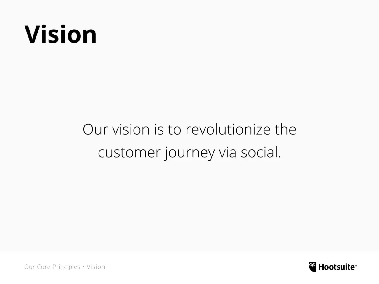
Slide 4 states that the vision is to revolutionize the customer journey via social. Slide 26 gives a related wording, "To revolutionize communication via social."
How many slides does the Hootsuite deck have?
The Hootsuite deck has 64 slides, and it opens with a title slide (slide 1) followed by a short introduction (slide 2).
How did Hootsuite's employee numbers grow according to the Hootsuite deck?
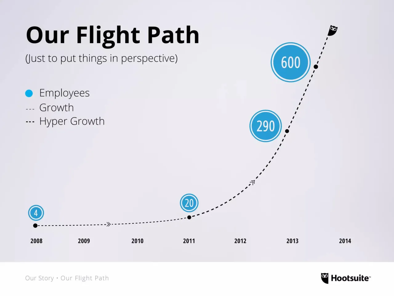
Slide 10 says the company was born out of Invoke in 2008 and has since gone from 20 to over 600 employees in under 3 years. Slide 11 shows the same growth story as a flight path chart.
How is the Hootsuite Peepsbook organised?
Slide 42 shows that the Peepsbook is organised into three chapters: Chapter 1 Who We Are, Chapter 2 What We Do, and Chapter 3 How We Do It.
Details
- Company: Hootsuite
- Type: Recruiting deck
- Industry: Social media software
- Pages: 64
Review score: 8 out of 10, Strong
Presentation quality, judged with the SlideDeck Co review heuristic. Ask, evidence and idea merit are not rated here.
The deck has a clear route for a new-hire audience: principles (4-8), story (9-13), culture and #BSU (14-26), reasons people enjoy working there (27-40), then the three-chapter Peepsbook (41-63) and a closing call (64). Slides carry one idea each in large type, with section footers on the early pages and colour coding by chapter that keeps the reader oriented across 64 pages. Visuals are used with purpose: the flight path chart on slide 11 turns the growth story into one image, the bike illustration on 12 carries the metaphor, and the real staff portraits with name and role make the quotes feel credible. Weaknesses are a few thin or flat pages, such as the sparse list slides 7 and 8, the black numbered bars on 29, 31, 33, 35, 37 and 39 that look empty, and small light attribution text on 43 to 63, which keep it from the top tier.
Worth keeping: Keep the one-idea-per-slide rhythm, the large Vision and Mission statements on 4 and 5, the flight path chart on 11 and the colour-coded chapter system.
Most useful repair: Fill or remove the empty black bars above the numbered headings on 29 to 39, and enlarge the tiny attribution text and the faint section labels on 43 to 63.
What would change the score: I would give the value and team lists on 7 and 8 a visual treatment, and add axis scale or source detail to the growth chart on 11 so the 2011 to 2013 jump reads precisely.
Confidence high. 64 of 64 pages inspected on contact sheets, 4 at readable size. Reviewed 2026-11-08. Model-assisted review (claude-sonnet-5-5).
Full text of the slides (64 slides)
Every slide's words and a description of its charts and images, so the deck can be searched and rebuilt. Also available as Markdown.
Slide 1
Hootsuite’s Manifesto
#BSU
Building a Social Revolution
Hootsuite™
Visuals: One logo: the Hootsuite owl mark with the 'Hootsuite™' wordmark, both solid black, placed bottom-right over the blue background. No photographs, charts or diagrams. Decorative background: a faint regular grid of small dark dots spaced about 67 px apart across the whole slide, with a radial vignette that darkens toward the corners.
Slide 2
This document is a resource for all Hootsuite employees. / We give this to each new team member who joins us.
Hootsuite's Manifesto contains our core principles, some stories / of our history and culture, and a special Peepsbook.
Introduction • Purpose
Hootsuite™
Visuals: Photograph of a woman's head seen from below the crown: dark curly black hair fills the upper-middle and sides, with her forehead, eyebrows, and eyes (looking up and to the side) visible at the bottom edge of the image. The photo is cropped by the bottom of the slide at the white footer band and extends full width. Lighting is soft and even, with a pale grey-lavender studio backdrop. Dominant colours: near-black hair, warm skin tones, pale lavender-grey background (#E4E3EA). No overlay or tint. Logo: Hootsuite owl icon with wordmark 'Hootsuite' and trademark mark, in black, at bottom right.
Slide 3
Our Core
Principles
Visuals: Full-bleed stylised illustration of a large owl face in a repeating line-drawn pattern: two large round eyes at left and right, a patterned brow arch across the top, feathers and scale-like motifs down the centre and wings, all rendered as slightly lighter blue linework and tints over the blue background. The pattern is low contrast and sits behind the title. One small white outline owl icon in the bottom-right corner, drawn as a white stroked shape with two white eyes, roughly 5% of slide width.
Slide 4
Vision
Our vision is to revolutionize the customer journey via social.
Our Core Principles • Vision
Hootsuite™
Visuals: Only the Hootsuite logo: a black owl head icon with two white eyes in a black shield-like silhouette, followed by the bold black wordmark 'Hootsuite' and a small superscript '™'. It sits at bottom-right inside the white footer band. No photographs, charts or diagrams.
Slide 5
Mission
Our mission is to empower organizations
to turn messages into meaningful relationships.
Our Core Principles • Mission
Hootsuite
Visuals: One logo: the Hootsuite owl mark with the wordmark 'Hootsuite' followed by a small trademark symbol, in solid black, placed bottom right in the footer band. No photographs, charts, or diagrams.
Slide 6
Our Culture
A passionate, egoless team having fun building something bigger than themselves.
Our Core Principles • Our Culture
Hootsuite
Slide 7
Our Team
Hardworking
Collaborative
Resourceful
Egoless
Innovative
Our Core Principles • Our Team
Hootsuite™
Slide 8
Our Values
Lead with humility
Grit in All We Do
Build a better way
Passion for Customer Success
Our Core Principles • Our Values
Hootsuite
Visuals: Logo: Hootsuite owl mark in black followed by the bold black wordmark 'Hootsuite' with a trademark symbol, placed at the bottom right of the footer band. No photographs, charts, or other graphics.
Slide 9
Our Story
Visuals: Full-bleed orange illustration of hand-drawn zigzag pine trees in a slightly darker orange tone, outlined in thick brushed strokes, with circular knot-like shapes and dots scattered between them. Along the bottom, tree trunks with faint, mirrored, illegible text marks sit on a horizon line. The illustration is tinted orange with a darker vignette toward the corners and edges. A white outline owl icon (white stroke, white eyes, shield-shaped body with a flat bottom-right edge) sits in the bottom-right corner, about 6% wide and 10% tall, not overlapping the title.
Slide 10
History
In 2008 Hootsuite was born out of Invoke, a digital marketing agency that Ryan founded in 2000.
For the first year, a seven-person team—one-third of Invoke—grew the zero-revenue product. (You don't need to be a CFO to understand that it was tough to make ends meet.)
But by 2009, viral growth and investment led us to spin it out as an independent company.
By 2011, we entered 'hyper growth,' and have since gone from 20 to over 600 employees—in under 3 years.
Our Story • History
Hootsuite™
Slide 11
Our Flight Path / (Just to put things in perspective) / Employees / Growth / Hyper Growth / 4 / 20 / 290 / 600 / 2008 / 2009 / 2010 / 2011 / 2012 / 2013 / 2014 / Our Story • Our Flight Path / Hootsuite™
Visuals: A dashed curve line (hyper-growth style, black dashes) plotted as a timeline from 2008 to 2014, rising exponentially from left to right. Black dots mark the curve at the 2008 start point (at about 2008 baseline), at 2011 (on the 20 marker), at about 2012.9 (just before 2013), and near the end at about 2013.5. Two small black chevron arrows sit on the curve: one near 2009.5 on the flat part and one near 2012.3 on the steep part. Four blue circular badges with white double outlines sit above the curve: '4' at 2008, '20' at 2011, '290' at about 2012.9, and '600' at about 2013.6, sized larger as the values grow. A black owl icon (Hootsuite owl) sits at the top end of the curve, pointing up-right, at about 2013.7. Legend: a solid blue dot for Employees, a short grey dashed line for Growth, and a short black dashed line for Hyper Growth. No axes or gridlines are shown; years are printed under the baseline with no numeric scale. Values are printed on the badges only.
Slide 12
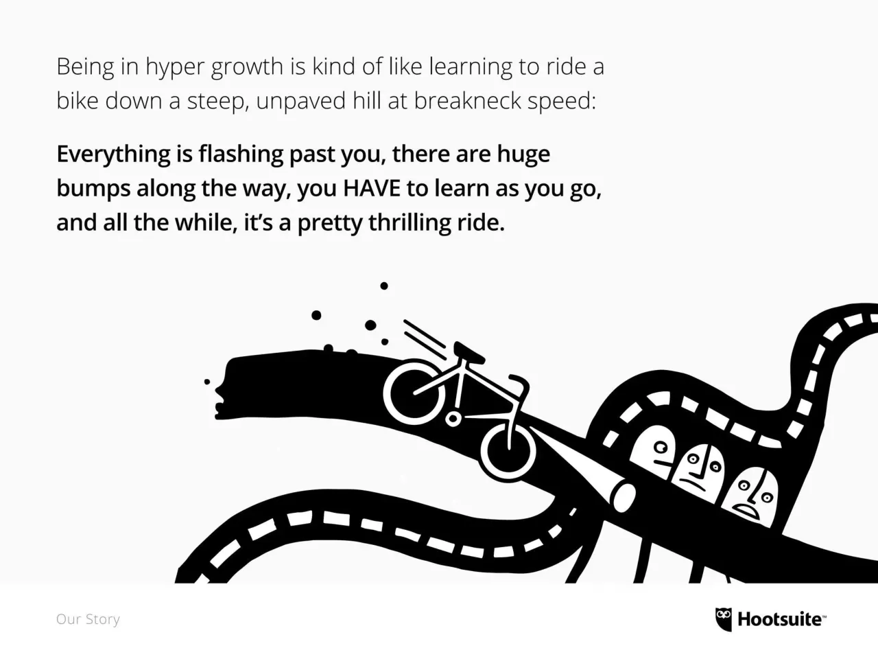
Being in hyper growth is kind of like learning to ride a / bike down a steep, unpaved hill at breakneck speed:
Everything is flashing past you, there are huge / bumps along the way, you HAVE to learn as you go, / and all the while, it's a pretty thrilling ride.
Our Story
Hootsuite
Visuals: Black-and-white illustration of a cyclist riding a bicycle down a steep, winding dirt path. The bicycle is white-outlined with black fill on a black hill ribbon; motion lines trail behind the rider and small dots (debris) fly up from the wheel. Three white-faced, grumpy-looking figures with simple dot eyes sit in a black tunnel-like curve on the right, and a black road with white dashed center lines curves across the lower left and up the right edge. Flat vector style, pure black and white, no shading or gradients. The artwork is cropped at the bottom by the footer band and runs off the right edge of the slide.
Slide 13
So what has kept us
balanced, focused and
steady on the seat?
Our Story
Hootsuite™
Visuals: One black-and-white ink illustration in a flat, cartoon style. A large black serpentine ribbon, dotted with white dashes like a track, runs from the lower left across the middle and rises to the upper right. On the upper section a cyclist rides a white-outlined bicycle with motion lines behind it and small black dots (splash or dust) above it; the bicycle is drawn in white line on the black ribbon. At the lower right three faces with closed or smiling eyes and open smiles sit inside a black cart or car-shaped form: the leftmost has wide open eyes and an open grin, the middle and right faces have closed eyes. A black drop-shaped element sits near the faces. The illustration is full-bleed to the right edge and cropped flat at the bottom by the footer band. No photograph, no overlay or tint.
Slide 14
Our Culture
Visuals: A full-bleed photograph of five people in a group, tinted blue, in front of a decorative patterned mural. The mural shows dense scale-like motifs, triangular zigzag bands and large circular medallions, all in a darker and lighter blue. On the left, a smiling man in a dark top stands behind a woman who is smiling with her hair down. On the right-centre, a man in a light shirt is turned toward the viewer, with a hand gesturing near the lower centre. At the far right edge, a bearded man smiles. A white-outlined owl badge in a blue circle sits on the mural at about x 86%, y 54%, width 9%, height 11%. The lighting is even and soft, the framing is a medium group shot cropped at the edges, and a uniform blue tint covers the whole photo. A white outlined owl logo sits at the bottom right.
Slide 15
Indeed, like other great companies before us, we discovered that culture is the gravity of a successful, fast-growing company. / It's the constant, steady force that binds us together and keeps us focused and driven. / It's what makes people want to come to work every day. / It's what makes us stronger than our competitors. / Our Culture
Visuals: One photograph on the right side of the slide, full-bleed to top, right and bottom edges, cropped at its left edge at the column boundary. Subject: a large, densely packed group of about fifty smiling people photographed from above, gathered on green artificial turf. In the foreground a young woman in a red top and black skirt sits on a blue exercise ball, a young woman in a maroon cardigan and grey top sits beside her, and a young man in a black zip hoodie and blue plaid shirt sits at right holding a black cane. Behind them a man in glasses and beard, and many other people in dark jackets, a woman in a red sombrero-style hat, and some people making heart shapes with their hands. Lighting is bright, even daylight. Dominant colours: green grass, blue ball, red and maroon clothing, with dark jackets behind. No overlay or tint.
Slide 16
This manifesto makes sure we hit the brakes and take a snapshot
of the most important aspects of Hootsuite's culture today.
"FOR THE PEEPLE*
BY THE PEEPLE."
This manifesto was created as a bottoms-up document. Employees from
across the organization were asked to provide input on what they feel.
*(At Hootsuite, we sometimes like to call each other
peeps when talking about large groups.)
Our Culture
Hootsuite
Visuals: A black Hootsuite owl logo with the wordmark 'Hootsuite' and trademark mark, placed bottom right. A large blue asterisk glyph (#00AEEF) sits at left beside the aside text, acting as a decorative bullet marker. No photographs, charts or diagrams.
Slide 17
A Brief History of #BSU
Visuals: Full-bleed photograph of a wall covered in split firewood pieces, cut faces turned outward, arranged in an irregular mosaic of semicircular and wedge-shaped pieces. The pieces are light tan, honey, orange-brown and rose-brown, with dark gaps between them. Lighting is a warm spotlight-like glow from the upper centre that fades to darker brown at the right edge and to mauve-brown at the bottom. Framing is a straight-on, close, filling view with no visible horizon or subject boundary. The photograph is not cropped beyond the slide edges and has no tint or overlay other than the black title band.
Slide 18
#BSU is a term that has remained a steady part of our culture throughout / our hyper growth. This is why it's a perfect symbol that captures the / culture and essence of our company. / What is #BSU? This is something that many of our new team members / wonder. Some have admitted they even Googled it when they first started. / Our Culture • #BSU / Hootsuite™
Visuals: Illustration of a Google search homepage mockup, centred horizontally in the lower-middle area. Shows the Google wordmark in its multicolour logo (blue G, red o, yellow o, blue g, green l, red e) at top centre. Below it a search bar containing the text 'What is BSU?' with a microphone icon at right and a blue search button with white magnifying glass icon at far right. Beneath the bar are two grey buttons labelled 'Google Search' and 'I'm Feeling Lucky'. At the bottom of the mockup is small text 'Google.ca offered in: ' followed by blue link 'Français'. Plain white and light grey background, flat rendering, no photograph, no shadow, not cropped. Hootsuite owl logo with wordmark in black at bottom right.
Slide 19
#BSU
Visuals: Photograph of a young man with short dark hair, a dark mustache and trimmed beard, wearing a dark grey crew-neck t-shirt. He looks up and to the right with an upward, questioning expression, and his face is turned slightly toward the right. He is shown in a head-and-shoulders close crop: the top of the head is cut off by the top edge, his right ear and face run off the right edge, and his torso is cut off at the bottom. The lighting is soft, even studio light falling from the front. The backdrop is a plain light grey seamless studio wall. Dominant colours: light grey #C8C7CA for the backdrop, dark charcoal grey #3A3B3F for the shirt, warm skin tones around #D9A486. The photo is full-bleed with no border, frame, overlay or tint.
Slide 20
= #Blow Shit Up
Visuals: One photograph, full-bleed, covering the whole slide. Subject: a young man with short dark hair, stubble and a dark moustache, wide-eyed with an open-mouthed excited grin, showing upper teeth, wearing a dark grey crew-neck sweater. Composition: tight head-and-shoulders crop, head and hair cut off by the top edge and face cut off by the right edge, face on the right third, body entering from the bottom right. Lighting: soft, even, frontal studio light with no hard shadows. Dominant colours: light grey backdrop about #C9C9CD, charcoal sweater about #3A3F46, warm skin tones about #E9B9A0, dark brown hair and moustache about #3B2A22. No overlay or tint. Not boxed.
Slide 21
Yup, B.S.U. is an acronym for ‘blow shit up’.
In the early days of Hootsuite, the phrase was widely used
by Ryan, as a motivational mantra to get people excited
about what they were working on: “Let’s blow shit up!”
(“Let’s build some internet people!”
was the other phrase he used a lot back
then, but didn’t stick in the same way.)
#BSU
#BSU
Our Culture • #BSU
Hootsuite™
Visuals: Photograph of a smiling man with short brown hair and a trimmed beard, wearing a white open-collar shirt, grey waistcoat and grey jeans with a dark belt, standing in profile facing right with one hand in his pocket and the other arm extended to the right, fist-bumping a hand entering from the right edge of the frame. Two black-outlined speech bubbles reading #BSU: a larger one above and right of his head and a smaller one further right and lower. Plain white studio background, soft even lighting, dominant colours white, charcoal grey and black with skin tones; the photo is boxed in the lower right area and is cut off by the slide's right edge and the footer band. The speech bubbles are white with black stroke and bold black #BSU text.
Slide 22
Before we knew it, “Let’s blow shit up!” was being used by / all departments across the company—in emails, chats, parties, / even town halls, and by everyone, from the newest intern to / our top VPs and executives. / And eventually, in true fashion of a social media / company, we made into a viral hashtag: #BSU / Peeps / BLOW SHIT UP / BSU / BSU / BSU / BSU / BSU / Hootsuite / BSU / BSU / BSU / Our Culture • #BSU / Hootsuite
Visuals: A faded word cloud of grey words in mixed sizes, centred horizontally around the middle-lower area: 'Peeps', 'BLOW SHIT UP', 'Hootsuite' and many repetitions of 'BSU' in bold sans-serif, the largest 'BSU' in the centre and smaller ones around it, all in light grey (about #E2E2E2 to #D0D0D0) with a soft fade so they sit behind the text as a background texture. The Hootsuite owl logo at bottom right is a black owl icon with eyes followed by the wordmark 'Hootsuite' with a trademark mark, in black bold sans-serif.
Slide 23
Why has #BSU lasted so long?
Our Culture • #BSU
Hootsuite
Visuals: Photograph of a hand-drawn pattern: loose, looping brown-to-black ink lines drawn over a mosaic of irregular pale cream and beige stone tiles, resembling stylised trees, branches, leaves and small animal or figure shapes. Composition is an all-over, edge-to-edge texture with no clear focal subject, fully cropped at the edges. Lighting is flat and even. Dominant colours: cream #E8D9CC, warm tan #B8793A, dark brown #3A2412, with a light grey-white haze tint over the whole image. The photo carries a pale translucent white overlay that softens its contrast. One Hootsuite owl logo (white owl mark with black wordmark 'Hootsuite' and trademark ™) sits bottom right on the white footer.
Slide 24
4 Reasons: / 1. #BSU is a pillar of our language and culture. / 2. It has lots of energy behind it. Like many of us here. / 3. It’s limitless. There are no limits to how much or how far you can ‘blow shit up.’ And it applies to all of us who work here. Whether it’s an amazing line of code or a new product or marketing campaign, we can all take our own project and blow it up! / 4. Finally, ‘blow shit up,’ is inherently disruptive in nature, just like we are. / Our Culture • #BSU / Hootsuite™
Slide 25
#BSU is a pillar of our / language & culture / Our Culture • #BSU / Hootsuite™
Visuals: One full-bleed photograph or illustration in the top band, showing a blue surface covered in hand-drawn marker scribbles. The repeated words are 'I will' and '#BSU', drawn in darker blue marker, with a large scribbled 'BSU' in the upper right and a loose cloud-like scribbled outline behind it. Several 'ore' fragments (the start of 'before' or 'more' cut off by the left edge) repeat down the left side. The composition is evenly distributed with no clear focal point except the central text block. Lighting is flat and even. Dominant colours are bright cerulean blue with darker blue scribbles. The image is cropped at the left and right edges and runs full-bleed to the top, left, right and the white band. It has a blue tint over the photo so the scribbles appear low-contrast. Solid black rectangles sit behind the centre text, one behind each line. No logos, charts or tables other than the Hootsuite logo in the footer.
Slide 26
The #BSU spirit is something we all embody internally,
so it's also reflected in our company vision:
"To revolutionize
communication
via social"
(we are revolutionaries!)
Our Culture • #BSU
Hootsuite™
Visuals: None apart from the Hootsuite owl-and-wordmark logo in the bottom-right corner: a solid black stylised owl head with two white eye circles, followed by the bold black wordmark 'Hootsuite' and a small superscript ™. No photographs, charts or diagrams.
Slide 27
Why We Love To / Come to Work
Visuals: Full-bleed decorative illustration behind the title, shown as a green-tinted monochrome folk-art style drawing. It has a face with a spiral eye on the left, a patterned teapot or vase with triangles near top centre, a cat-like figure with pointed ears on the right, and a hand holding a stick or pen at upper right. A faded LinkedIn 'in' circle sits at upper right, and a faded Facebook 'f' circle sits at centre right. The image is cropped to the slide edges with a darker vignette at the corners. A green tint overlay sits over the whole image. A white outline owl logo sits in the bottom-right corner.
Slide 28
In the course of researching this document, / we asked dozens of people why they love to come to work. / There were some very common themes that arose: / Why We Love To Come To Work / Hootsuite
Slide 29
1.
High Caliber
Teammates
At Hootsuite, you get to work with really interesting, smart, open-minded people. They're good at what they do because they're passionate about it.
Why We Love To Come To Work
Hootsuite
Visuals: Logo: the Hootsuite owl mark with the wordmark 'Hootsuite' and trademark '™' in black, located bottom right in the footer. No photographs, charts or other illustrations.
Slide 30
“When I first came in, I was / vibrating with excitement. / There was just a certain vibe and / you could tell everyone wants to / be here, and they’re good at what / they do and care about their jobs.” / Erin Fitzpatrick / Administration Ambassador / Why We Love To Come To Work / Hootsuite™
Visuals: One photograph of a smiling woman with long wavy strawberry-blonde hair, shown from the nose down on the left and cropped by the left edge of the slide, with one blue eye visible under a fringe of hair. She wears a black knit top and a thin gold necklace. Her head is turned slightly toward the viewer and she is smiling with teeth showing. Background is a plain soft grey-lavender studio backdrop, lit evenly from the front with soft shadowless light and a slight darkening toward the upper right. The photo is full-bleed across the top section, cropped at the top and bottom, and ends at a hard horizontal edge where the white footer band begins at about 88.5% of the slide height. Dominant colours are warm peach skin and honey-blonde hair against grey-lavender and black. The quote text overlaps the grey backdrop area only, not the woman. One Hootsuite logo at bottom right: a black owl icon with two round eyes followed by the bold black wordmark Hootsuite with a small trademark symbol.
Slide 31
2.
You are on a steep learning curve.
Coming to work is an opportunity to gain invaluable knowledge.
By working at Hootsuite you are getting years of career experience at an accelerated rate simply by being part of this unique growth.
Why We Love To Come To Work
Hootsuite
Visuals: A Hootsuite logo at bottom right: a black owl head icon with two circular eyes followed by the bold wordmark 'Hootsuite' with a trademark symbol. No photographs, charts or other graphics.
Slide 32
“I am certain the rest of my life will be better because / I worked here. Now I’m a part of a community of people / who can think outside the box and will probably create / the next big thing—and that’s really cool.” / Scott Walker / Corporate Account Executive / Why We Love To Come To Work / Hootsuite
Visuals: Photograph of a man's head in right-side profile, cropped so only the forehead, eyes, eyebrows, nose tip, ear and a mid-grey-to-dark-brown hair mass are visible, with the hair running down the right side of the frame. He is looking to the left with a focused, slightly furrowed brow. Lighting is soft and even, with skin tones in pale peach and pinkish highlights. The background is a flat light lavender-grey wall. The photo fills the upper panel edge to edge, cut off at the bottom of the panel and at the right edge, with no border and no tint. Hootsuite owl logo with wordmark in black, placed bottom right.
Slide 33
3.
Having an impact
Here we have an opportunity to play a huge role in the forming of an entire industry, an entirely new communication channel—no different than the TV or radio or email at their emergence. These things shook the world and now social is doing that.
You can really make a difference. Whatever you are working on, you can see millions of people using it—or see how it has a direct connection to revenue. That's incredibly rewarding.
Why We Love To Come To Work
Hootsuite
Visuals: A black rectangular section bar spanning the width between about 4.5% and 95.3% horizontally and 6.6% to 14.6% vertically, containing the white numeral '3.'. The Hootsuite owl logo with wordmark in black at bottom right. No photographs, charts or other graphics.
Slide 34
“At Hootsuite there are so many opportunities right now where I know I can have an impact and make the product better. That’s why I’m here.” / Helen Park / Mobile UX/UI Designer / Why We Love To Come To Work / Hootsuite™
Visuals: One photograph: a smiling woman with voluminous dark curly hair blown to her left, wearing large gold hoop earrings and a white top with grey speckled texture. She is turned three-quarters toward the right edge of the frame, eyes glancing right, and her head and shoulders are cropped by the right and bottom edges. The photo is full-bleed at the top and right, with its bottom edge meeting the white footer band at about 88% of slide height. Lighting is soft, even studio light. Dominant colours are pale lavender-grey #CFCFD8 for the backdrop, near-black #1E1E22 for hair, warm skin tones around #E8B9A4, and white #FFFFFF for the top. There is no overlay or tint. One Hootsuite logo: black owl icon followed by bold wordmark 'Hootsuite' with a trademark mark.
Slide 35
4.
Opportunity for growth
It's a time of great movement and opportunity—the company's hyper growth is creating whole new pockets and paths to delve into... without stepping on anyone's toes.
Why We Love To Come To Work
Hootsuite
Visuals: None apart from the Hootsuite owl logo lockup in the bottom-right corner: a black owl mark with two white eye circles followed by the bold black wordmark 'Hootsuite' with a small trademark symbol.
Slide 36
“One of the biggest things here is if / you’re eager for an opportunity to / wear different hats, there aren’t a lot / of barriers to take on new challenges / beyond your designated role.” / Korey Gannon / Talent Advisor / Why We Love To Come To Work / Hootsuite
Visuals: Photograph of a young man with short swept-back brown hair, blue eyes, slight closed-mouth smile, facing the camera head-and-shoulders in a navy crew-neck t-shirt. He occupies the right side of the slide, cropped at the bottom edge of the photo area, with the top of his hair near the top edge. Lighting is soft and even, studio style. Dominant colours: light grey-lavender backdrop (#E4E4EA), navy shirt (#1F2F5A), warm skin tones. The photo is full-bleed above the white footer band with no border or tint. Hootsuite owl logo: black owl icon with the wordmark 'Hootsuite' in bold black sans-serif with a small trademark mark, placed bottom-right.
Slide 37
5. / A Holistic Life / Our quality of life is supported at work. There are things at the office like yoga, fresh juice, organic fruit, dogs, a gym and a nap room—not because it's a gimmick or because everyone is doing it, but because we are already people who pursue a healthy lifestyle and work-life balance. / Why We Love To Come To Work / Hootsuite
Visuals: Logo: Hootsuite owl mark with bold wordmark 'Hootsuite' with trademark symbol, black, bottom right. Decorative black filled rectangle as the top section bar. No photographs, charts or diagrams.
Slide 38
HOOTSUITE / OWLGANIC / ALE
Visuals: Four photographs in a 2x2 grid. Top-left: a frosted glass door or panel with etched gold-brown lettering, only partly legible as fragments of letters such as B, I and Z, overlaid with black line-drawn leaves and branches; beside it a wood-panelled wall with two folding camp-style lounge chairs with dark cushions and a painted sunset-forest mural above; warm incandescent lighting. Top-right: an indoor yoga class of about 30 people in cobra or upward-facing dog pose on dark grey mats on a polished concrete floor, with teal, red, pink and black clothing, teal and light blue foam blocks, cream curtains along the back wall and a barred window at top right; the instructor's back is in the lower foreground; daylight from windows and overhead lights. Bottom-left: a woman in a dark blue jacket and a man in a light blue sweater with a steel wristwatch leaning over a wooden raised planter of young green seedlings with white plant markers; close framing, shallow depth of field, daylight, dominant greens and blues. Bottom-right: close-up of a royal blue textured fabric (a yoga mat) with a white printed octagonal badge in navy: a navy owl head at top, wheat sprig icons on the left and right, a navy ribbon banner reading HOOTSUITE, and below it a sprout icon, the words OWLGANIC and ALE in navy capitals, and a second sprout icon; the badge is slightly tilted and fills most of the quadrant.
Slide 39
6.
Freedom
At Hootsuite there is a culture of trust. We are given autonomy to get our work done. No one is monitoring when I take my lunch or punch in...or out. And that's what frees us to go beyond expectations.
Why We Love To Come To Work
Hootsuite
Visuals: Logo: Hootsuite owl-and-wordmark logo in black, bottom right, showing a stylised owl icon with two round eyes followed by bold 'Hootsuite' wordmark with a trademark mark. No photographs, charts or illustrations.
Slide 40
“I’m living a dream as the
founder and CEO of Hootsuite.
Our product touches billions
of people and I’m surrounded
by an amazing team who loves
innovation as much as I do.”
Ryan Holmes
Founder & CEO
Why We Love To Come To Work
Hootsuite™
Visuals: Photograph: a bearded man with short swept-back hair, looking toward the viewer and speaking, in a medium close-up framed from the waist up. He wears a red and charcoal buffalo-check flannel shirt with a small leather 'Penfield' label on the chest pocket. Behind him is a wall of irregular rust-brown stone or tile pieces. Lighting is soft, warm and frontal, with a slight falloff toward the right. Dominant colours are rust brown #8B4A2B, red #B83A2E and charcoal #2E2E2E, with warm skin tones. The photo is full-bleed across the top and is cropped at the left, right and bottom edges by the slide edges and footer band. No overlay or tint is applied. Logo: the Hootsuite owl mark with the wordmark, in black, placed in the footer. No other visuals.
Slide 41
The Peepsbook
As a Hootsuite employee, we / want you to have this Peepsbook / to guide you in your journey.
What is the Peepsbook? It’s a / passionate, united expression of / What We Do, How We Do It, and / most importantly—How We #BSU.
THE PEEPSBOOK | WRITTEN BY THE PEEPS
Visuals: Logo: the Hootsuite owl mark, drawn as a white outline with two round white eyes and a small beak, set inside a circle of slightly darker blue (about #1194D6) centred on the left panel. Spine: a rectangle of darker blue (about #1296D6) with rotated white bold capital text and a thin vertical rule separating the title from the lighter-weight line. Page curl: a small darker blue triangle (about #1296D6) at the bottom-right corner that folds up to reveal a white triangle beyond the cover edge. No photographs or charts.
Slide 42
MONTY
Chapter 1
WHO WE ARE
Chapter 2
WHAT WE DO
Chapter 3
HOW WE DO IT
Visuals: Photograph (left half, full-bleed, hard-edged at x=50%): a young smiling man with short dark hair, heavily out of focus, stands in front of a plain grey-beige wall and holds a cream and fawn pug puppy up to the centre of the frame with both hands. The puppy faces the camera, wears a grey bone-shaped tag reading MONTY on a collar, and its front paws dangle at the bottom left and right. The man wears a red crew-neck t-shirt. Composition is a waist-up portrait, with the puppy in sharp focus at the centre and the man softened behind it. Lighting is soft, even and frontal. Dominant colours: warm grey #A39C95, red #D42A23, cream #F1E6D2, fawn #C9A77C. Cropped at the top and bottom edges of the slide; no overlay or tint. Logo (top right): a solid blue circle containing a white line-art owl with two round eyes, shown in a single flat colour with no outline.
Slide 43
Chapter 1 • Who We Are
We Are Pioneers
We’re proud to be at the forefront
of the social revolution, a one-of-
its-kind company with top talent
in the city. country. globe.
In this way, we are pioneers.
This all contributes to our shared
sense of purpose.
“We never set out to
build a product that was
going to help a protester
in Egypt have a voice;
it was really about
making a good product
to help people...it still is.”
Paul Donnelly
Principal UX Designer
(and one of Hootsuite’s
first 4 employees)
Visuals: One photograph: a small circular headshot of a smiling young man with short light-brown hair, shown from the chest up, facing the camera, in front of a dim, dark-brown and grey indoor background; soft, even front lighting; centred in a circular crop with no border, sitting at the left of the attribution block. One dashed vertical hairline divider in light grey (about #D0D0D0), running full height at about x 50%. No charts, tables, logos or icons.
Slide 44
Chapter 1 • Who We Are
Hootsuite is a special and highly unique experience that we all feel lucky to be a part of. It feels great to be a part of an unprecedented success on such a huge trajectory.
We all have this sense we are in the midst of having a once-in-a-life-time opportunity. When will we ever experience this again in our lives?
“Being at Hootsuite in the beginning was akin to walking into Vivienne Westwood's SEX shop and witnessing the Sex Pistols learn how to play their first 3 chords.”
Chris Trottier
Strategist, Alternative Growth Channels (and early Hootsuite employee, on witnessing firsthand the beginning of communication revolution)
Visuals: One circular portrait photograph of a smiling man with short brown hair, dark grey t-shirt with light blue collar, chin resting on his right hand (thinking pose), plain light grey background, head-and-shoulders framing, soft even daylight, cropped to a circle about 15% of slide width. Otherwise none.
Slide 45
Chapter 1 • Who We Are Who Thrives at Hootsuite? ✓ People who like to experiment and always try new things. ✓ People who are self-directed and self-motivated. ✓ People who never rest until the job is done. People who thrive at Hootsuite are passionate, driven, hustlers; entrepreneurial by nature.
Visuals: Three black hand-drawn checkmarks, one before each bullet in the left column, with a slightly brushed, ink-like stroke. A decorative illustration fills the right blue panel: faint, lighter-blue line-art of birds, a figure in a cap and cloud shapes, drawn in a flat cartoon style. It is full-bleed within the right panel, low contrast (about 10 to 15% lighter than the panel), and sits behind the white statement text. No photographs, charts or logos.
Slide 46
Chapter 1 • Who We Are
We celebrate our diversity and pride ourselves on it
We refuse to be cogs in the wheel.
We are agile and don’t waste time in countless meetings.
We are egoless, resourceful, and driven by purpose.
We are people who see possibilities over limitations.
“We’re hustlers—in that we hustle by nature. We ‘just do it.’ Our focus is on getting it done. Because if you can’t ship it, it’s irrelevant.”
Beier Cai
Director of Technology (and one of Hootsuite’s first 4 employees)
Visuals: One circular portrait photograph of a smiling man with short black hair, wearing a dark red collared shirt, against a plain light grey backdrop; head and shoulders, frontal, soft even lighting; cropped to a circle, not full-bleed, with no overlay or tint. A faint dashed vertical line (light grey #D0D0D0, about 1 px) runs full height at about 50% of width. No charts, tables, logos or icons.
Slide 47
We are our own vibrant
community of artists, builders,
dreamers, and everything else.
Visuals: One logo: a white outline owl head with two round eyes and a small beak, drawn as a single line with a flat-bottomed shield-like body, in the bottom-right corner. No photographs, charts or diagrams. A thin dashed white vertical line at the centre of the slide, low opacity, running full height.
Slide 48
Chapter 1 / WHO WE ARE / Chapter 2 / WHAT WE DO / Chapter 3 / HOW WE DO IT
Visuals: Photograph on the left half, full-bleed to top, bottom and left edges, hard edge at the centre line. Subject: two men walking across a bright green artificial-turf floor in an open-plan office. The man on the left wears a red and dark plaid short-sleeve shirt, dark shorts and navy slip-on shoes, and gestures with his right hand; the man beside him wears a light grey-blue button shirt, dark jeans and white sneakers. Behind them is a corrugated grey-metal meeting pod with a glass door, a wooden table, black chairs and pendant lamps; tree trunks with green leaves rise through the space, and exposed white ducts run along the ceiling. Composition is landscape, subjects in the left-centre third, with the floor filling the lower half of the frame. Lighting is warm, indoor, mixed ceiling lights. Dominant colours: vivid green (#6DBE45-like) floor, warm off-white ceiling, grey metal, and brown wood. Logo: a green circle (#8DC63F) with a white owl outline icon, at top right of the text column, about 14% of width. No overlay or tint on the photo.
Slide 49
Chapter 2 • What We Do / What We Do / Hootsuite was perfectly positioned to ride the social wave. We built a product that filled the void faster and better than anyone else. / We've been ahead of the game from the start, learning, reiterating, improving on social media technologies. It's a great place to be. / Being in this advantageous position, we've become an advocate for businesses who want to evolve. / We give customers a voice they didn't have before social media. We can help empower businesses and people to turn messages into meaningful relationships. / (To top it off, we get to work with cool customers who similarly 'get' the potential of new tools like social and have open minds.)
Slide 50
We are part of a revolutionary
change in communication.
We have the potential to change
the way people around the world
interact on a large scale.
Visuals: One small white line-art owl logo in the lower-right corner, at about x 88%, y 81%, width 5%, height 10%. The owl has a rounded head with two round eyes with pupils and a small beak, sitting on a rectangular body with a curved bottom edge. Stroke is thin white outline with no fill. A thin dotted vertical line runs down the centre seam where the two colour halves meet.
Slide 51
Chapter 2 • What We Do
Purposeful Work
We live and breathe social media.
We 'grew' up on it, and it's in our
DNA. We know social media inside
and out, and we want to share our
experiences with others.
At Hootsuite, we are building some-
thing with a purpose: It's a product,
a solution, a community, an industry.
"In this space we're the most
legit tech company. We're like
the Google of social media.
It's a culture thing, it's a
product thing, it's a people
thing. We have a strong
engineering culture, a real
respect for the product and
we're not just in it to make
some cash and get out."
Mo Zahid
Lead Analyst,
Online Revenue
Visuals: One circular headshot photograph of Mo Zahid, bottom-right column. Subject: a man with short dark hair and a beard, seated on the floor with knees up and hands clasped, wearing a dark long-sleeve top and dark trousers. Composition: full-body seated figure, centred, in a circular crop, with a pale grey concrete wall behind and a dark horizontal floor edge at the bottom. Lighting: soft, diffuse, even. Dominant colours: warm grey, beige, charcoal black. Cropped to a circle, not full-bleed, no overlay or tint. No charts, tables, logos or icons.
Slide 52
Chapter 2 • What We Do / We Give Back / Because we are leaders in the space, many of us have found ourselves quickly becoming mentors to our teammates and the greater community. / So we connect with our local community and support others and share our knowledge—it's very important for us to give back and share our experiences.
Visuals: One photograph on the right half, full-bleed, cropped to the right half edge at about x=50%. Subject: a group of people at a workshop or hackathon table; in the foreground a young Asian man with black hair and clear-framed glasses, wearing a red t-shirt, looks toward the camera and smiles; behind him are blurred heads of other people, and at lower right a laptop screen with purple display is partly visible; a person in a dark striped top is in the lower foreground. Composition: medium close-up, subject placed left of centre of the photo, shallow depth of field with background blurred. Lighting: warm, soft natural/indoor light. Dominant colours: warm brown and tan background, black hair and clothing, red shirt, purple laptop screen. No overlay or tint; the left text panel is a near-white gradient fading into the photo edge.
Slide 53
Chapter 1 / WHO WE ARE / Chapter 2 / WHAT WE DO / Chapter 3 / HOW WE DO IT / #BSU / TEAM ES
Visuals: Photograph, left half, full-bleed and not boxed. Subject: four life-size bronze statues of baseball players in caps and uniforms, holding bats, stand on a brick-faced wall behind a granite plinth. In front of them a mascot costume of a cream and brown owl with large white-rimmed eyes and a yellow beak wears a navy blue jacket with a small orange and white logo on the chest, and a light blue tie, and sits with yellow striped legs and feet on the plinth. The plinth carries the partly hidden lettering TEAM and ES. A green roll-down shutter is at the far right and a grey concrete pavement at the bottom. Composition: eye-level, mascot centred slightly right of the frame's centre, statues cropped at the top edge. Lighting: soft daylight. Dominant colours: rust red brick, bronze brown, navy blue, cream, yellow and grey granite. Not tinted, no overlay. Second visual: orange circular logo badge, top right, with a white outline owl head icon inside. Hand-drawn elements: a black strikethrough line across DO IT in HOW WE DO IT, and a black marker-style handwritten hashtag #BSU beneath it.
Slide 54
Chapter 3 • How We #BSU
Even though we have a competitive advantage, we don't ever sit back and get complacent. Our blades are always sharpened—We're always ready to take down the competition.
We think long term, because we're building a 50-year company, not a 5-year one. We approach it like we are running a marathon, not a sprint.
"You can become really arrogant when you have some success. But when you are on top you have way more to lose. We don't think here, 'We made it—let's just rest on our laurels.' At Hootsuite we keep challenging ourselves to the next level."
Andrea Lemon
Corporate Account Executive
Visuals: One circular cropped headshot photograph of a smiling woman with blonde hair pulled back, wearing a dark top, against a light grey and white backdrop, placed bottom-left of the right column, about 6% of slide height in diameter ... approximately 9 percent width. No charts, tables, logos or icons.
Slide 55
HOW WE / #BSU / Work out loud / We strive to constantly give each other / visibility into the bigger picture. / Keep open doors / We have an open door policy for everyone, / no matter what position. Our offices there- / fore have no walls or barriers (physically or / metaphorically). / Set visible, big picture goals / Knowing what others are doing and seeing / big picture goals helps us better support / each other and share a greater sense / of purpose.
Visuals: Photograph occupying the full left half of the slide, full-bleed to top, bottom and left edges, with a hard vertical edge at about 50 percent width. Subject: a person seen from behind in a bright cyan-blue hooded top with the hood up, turning the head to look over the shoulder, flexing both arms so the fists are raised beside the head and shoulder. A white owl-shaped emblem is printed on the back of the hoodie lower left. Lighting is soft and even, from the front. Dominant colours: cyan-blue #2AB3E6 for the hoodie, warm light grey #D5CDCB to #BDB8B8 for the wall. Framing is a medium-full shot cropped at the bottom edge and the left edge. No overlay or tint.
Slide 56
We foster collaboration
without barriers.
Visuals: One logo: a white outline line-art owl icon in the bottom-right corner, with a rounded head, two circular eyes with pupils and a small beak, drawn with a thin white stroke and no fill. No photographs, charts or other graphics.
Slide 57
Chapter 3 • How We #BSU
WE LIKE DANIEL:
“Human beings have an innate inner drive to be autonomous, self-determined, and connected to one another. And when that drive is liberated, people achieve more and live richer lives.”
– Daniel Pink, Psychologist
Visuals: One orange filled circle (about 11% wide, 14% tall in the upper centre) containing the two-line uppercase label WE LIKE / DANIEL: in thin white sans-serif capitals. A faint vertical dashed grey line runs top to bottom at the horizontal centre, behind the quote. No photographs, charts, icons or logos.
Slide 58
Chapter 3 • How We #BSU
We have an agile and uniquely innovative work environment
Working at Hootsuite, you get to be a pioneer, shape trends, be a part of the newest and emerging technologies. Everything is exciting because we're on the cutting edge of our industry.
There is always a new challenge and the learning doesn't stop.
“Most other tech companies have a longer release cycle.
At Hootsuite, factors like bureaucracy or infrastructure don't get in the way so we're releasing at a rate of 10 times a day. Your code is basically going straight to production. That's why we really need to trust each other.”
Bill Monkman
Lead Software Engineer
Visuals: One circular headshot photograph of Bill Monkman, a man with short dark hair and a short beard wearing a dark brown t-shirt with a small cat graphic, against a blurred light grey indoor background; soft even lighting, head-and-shoulders framing, cropped to a circle about 15% width at the lower right of the quote column. No chart, table, or other visuals.
Slide 59
Finally, we embrace change
at work, not fear it.
With change comes growth.
Visuals: A thin dashed vertical guide line runs from top to bottom at the horizontal centre (x about 50%), drawn in white at reduced opacity over the blue. One logo: a white outline owl icon in the bottom-right corner (x about 88%, y about 81%, about 5% wide and 10% tall), with a rounded top, two round eyes with pupils, a small beak, and a flat-cut right edge. No photographs, charts, or diagrams.
Slide 60
Chapter 3 • How We #BSU
In this way, over time, we have built a culture of inclusion, community, and support—you can try to manufacture that but you can't.
“People here step in without hesitation. They're proactive helpers. The startup culture has fostered this. And there's a very tight team feeling that you don't necessarily find elsewhere.”
Jaime Stein
Senior Manager, Social Media
Visuals: Photograph of a smiling woman with shoulder-length wavy light-brown hair with blonde highlights, blue eyes, a small nose ring, wearing a mustard-yellow ribbed knit top. Head and shoulders, framed from mid-chest up, cropped at the bottom edge and the left/right of the grey panel; the photo is full-bleed within the left half with a plain grey studio backdrop. Lighting is soft, even studio light; dominant colours are mustard yellow #D9A21B, warm brown hair, and neutral grey #BDBBBE background. Second photo: a small circular headshot of a smiling bald man with a short beard in a dark navy blazer over a light blue collared shirt, on a white background, with a thin grey circular outline, about 6% of slide width in diameter, placed left of the attribution text.
Slide 61
Chapter 3 • How We #BSU
In the same way we don’t fear
change, we don’t ever fear failure.
At Hootsuite, when we have a good
idea, our best leaders say,
“Try it. And let’s just see
what happens. If it doesn’t
work, we’ll learn from it.”
You get visionary leadership here
who (for the most part) let us take
risks, and make our own decisions,
as long as we learn from our mistakes.
Visuals: One photograph on the left half, full-bleed top to bottom and cropped at the left and right edges of its box, with a hard vertical edge at 50 percent of the slide width. Subject: a person in a mascot costume seen from behind, showing a large round grey and beige plush head (left half grey, right half beige, split vertically) over a bright blue mesh jersey printed with the white block letters HOOTSUITE on a band across the upper back and the white number 1 with gold outline and a white hash-shaped numeral on the lower left of the jersey. Behind the mascot is an outdoor urban scene: a dark canopy or awning overhead, a sign partly reading WAND, pedestrians in dark and red clothing at the left edge. Lighting is flat daylight with soft shadows. Dominant colours: royal blue #1E6FD9, grey #8E9298, beige #C9BBA2, dark grey #2E3136. Composition is a close, tight crop with the head filling the upper half of the image. No overlay or tint.
Slide 62
Chapter 3 • How We #BSU
In fact, this is how Hootsuite came to be. So this remains still a core principle throughout:
“Always believe in the projects that make you excited and drive you to do ‘crazy’ things. You might not end up at the exact destination you set out to reach, but it will eventually lead somewhere better than if you never tried.”
– Ryan Holmes, Founder & CEO
Visuals: One photograph on the right half: a bearded man with swept-back hair in a black button-up shirt and dark jeans and black high-top sneakers sits on a cut log stool in front of a fieldstone fireplace. He is smiling toward the camera with his hands clasped on one knee and a black wristwatch on his left wrist. Above the mantel is a carved wooden moose head mounted on the stone wall; on the mantel are a dark brown bottle and a cream ceramic jug, and a stack of cut firewood sits in a recess to the right. Behind him a dark fireplace opening with a small fire glow. A red and black patterned rug fills the bottom right foreground. Composition is a vertical-ish full-height crop with the subject centred slightly right of the image centre and framed from the knees up with the moose head cropped at the top edge. Lighting is soft and even, warm on the wood, with a neutral, slightly warm colour cast. Dominant colours: grey stone, warm wood tan, black, red. The photo is full-bleed to the top, bottom and right edges with no border or overlay.
Slide 63
“Here there’s an overall / sense of curiosity and / inquisitiveness. It seems / everyone is always / chipping away at some- / thing everyone is trying / to push something / somewhere. It’s a culture / of optimism.” / Josh Lamb / Software Engineer / (formerly Junior Accountant)
Visuals: Photograph, full-bleed and cropped at the left, top, bottom and the 50% vertical edge: a crowded group selfie of about 30 people dressed in white, many smiling or open-mouthed. A woman in a white lace-top dress stands on the shoulders of a man in a white shirt and blue mirrored sunglasses, near the top centre. In the foreground a bearded man in a light grey fedora shouts with an open mouth, beside a man in white wayfarer-style sunglasses and a woman in dark sunglasses. White inflated balloons behind the crowd show partial letters ('VE' at upper left, 'L' at right edge). Lighting is bright, flat overhead fluorescent light. Dominant colours are white, grey and warm skin tones, with dark hair. No overlay or tint. Circular headshot, about 9.4% wide, with a thin light grey (#C8C8C8, about 1 px) outline and a plain white background: a smiling young man with short brown hair in a red and navy plaid shirt, shown head and shoulders, centred.
Slide 64
We’re also going to share / this document with the world / in hopes they can use it as / a template for their own / organizations and learn more / about ours. / THE PEEPSBOOK | WRITTEN BY THE PEEPS / So...are / you ready / to #BSU? / click here to / BSU!
Visuals: One decorative illustration: a full-bleed peacock-feather pattern tiled over the left zone (0 to 48% width, full height) in tonal blues. Feather motifs are arranged in overlapping scalloped rows, rising diagonally from lower-left toward upper-right, rendered at low contrast (about 5% lighter and darker than the base blue). A darker blue vertical spine strip (about #1A8FD0) sits over the seam at 48% to 52%. One circular button shape: a filled disc in a slightly darker blue (about #0E8FD6) with a soft darker drop shadow along its lower edge, centred at about x 65%, y 46%, diameter about 17% of slide width. Inside it, a small serif line and a large outlined sans wordmark. No photographs, charts or logos.
Download this deck
The hosted PDF of every library deck is free for readers of the SlideDeck Co newsletter. Join with your email and the viewer and download appear here.
Building a deck of your own? The SlideDeck Co Standard Deck is a slide library for business presentations: reviews, updates and plans.