The deck opens with a cover and a quoted press clipping from The Stanford Daily describing how the site has swept through campus. It then explains what thefacebook.com is, an online directory linking students, alumni, faculty and staff at colleges. Next it covers the user profile, the intra-school and inter-school networking features, and the school launch timeline in two tables, one for Ivy League schools and one for others. The audience section sizes the college market and its spending, followed by a series of user demographics and site usage slides with figures from March 2004. A user growth slide describes the trend in plain terms. The sales part follows, covering online marketing services, targeted advertising parameters, ad sizes and rates. It closes with a contact slide naming the company's CFO and a second press quote from The Harvard Independent. Slides worth studying include the demographic breakdown slides, which use one large figure per slide, and the school launch tables, which present a timeline as a simple grid.
Full text of the slides (26 slides)
Every slide's words and a description of its charts and images, so the deck can be searched and rebuilt. Also available as Markdown.
Slide 1
[thefacebook]
Facebook’s original pitch deck
MEDIA KIT
SPRING 2004
Visuals: Only the [thefacebook] wordmark in the top-right corner and a faint grid pattern across the full background. The grid is a set of thin, slightly lighter blue lines forming square cells about 1/10 of the slide width, with a few diagonal hairlines. No photographs, charts or illustrations.
Slide 2
[thefacebook]
Slide layout
Cover
Killer opening quote
Solution
Product Description
Market Validation
Vision
Market size
User Demographics
User Engagement ✓
Growth Metrics
Services
Contact Us
Killer closing quote
Modify this templates as you see fit, some slides may not be applicable for your pitch.
Visuals: One logo: the wordmark '[thefacebook]' in the top-right corner, set in white bold sans-serif with square brackets, with no icon. Behind everything is a faint lighter grid of thin vertical and horizontal lines, roughly every 10% of the slide width and height, at low opacity. Bullet glyphs are small white solid dots. A check mark (✓) follows 'User Engagement'. No photographs, charts, tables or diagrams.
Slide 3
[thefacebook]
The Stanford Daily, 03/05/2004
Classes are being skipped. Work is ignored. Students are spending hours in front of the computer in utter fascination. Thefacebook.com craze has swept through campus.
"
Visuals: A thin light-blue horizontal rule (about 14% of slide width) to the left of the attribution line, at the attribution's vertical centre. A faint grid of thin lighter lines covers the background, forming large squares about 8% of slide width apart with faint diagonal cross-hatching. No photographs, charts or icons apart from the wordmark logo.
Slide 4
[thefacebook]
What is thefacebook.com?
thefacebook.com is an expanding online directory that connects students, alumni, faculty and staff through social networks at colleges and universities. This online directory allows for user connections on the basis of friendship, courses and social networks (including intra and inter-school networks), and has a built-in messaging system.
Slide 5
[thefacebook]
User Profile
Each thefacebook.com user maintains and updates a profile that includes:
Contact information
Personal information: relationship status and procurement, political views, clubs, jobs and favourite music, books, movies and quote.
Course information: the site has a built-in database of school courses and concentrations and automatically builds a user's class schedule.
Picture
Visuals: One screenshot of a web profile page (thefacebook site) placed in the lower right, boxed with a thin light border and slightly rounded corners. It shows a blue-and-white web page: a header bar with a globe-pattern banner and the text [thefacebook]; a left sidebar with small links and a 'CHECK IT OUT' panel; a central 'Sean Parker's Profile' area with a 'Picture' box containing a head-and-shoulders photo of a young man with short curly light-brown hair, white open-collar shirt and brown tie, against a black background, lit from the front; below it boxes for 'Connection' ('You are friends with Sean.'), 'Mutual Friends' and 'Actions'; a right 'Information' panel with blue section headers for Account Info, Basic Info, Contact Info and Personal Info, listing fields in small type with blurred values; and 'Groups' and 'Courses' panels at the bottom. Dominant colours are medium blue headers #3F6DB5, white panels and a white photo background behind the screenshot. No overlay or tint on the screenshot.
Slide 6
[thefacebook]
Additionally, thefacebook.com automatically adds to each user profile links to school news articles that refer to the user, the last user-away message in the AIM system and the last user access location (the site has a built-in database of school dormitories and halls).
Visuals: Full-bleed photograph of a long arcaded cloister or colonnade in a stone university building: rows of pointed Gothic arches and stone columns recede toward a vanishing point at the centre, with vaulted ceilings above and a paved floor below. Lighting is dim and warm on the sandstone surfaces at the sides, with cool blue-grey light pooling on the floor and in the far centre opening. Composition is a one-point perspective with the camera at about eye level, showing the full width of the arcade. A dark navy-black tint overlays the whole photograph, darkening the top and edges. Dominant colours are dark charcoal-brown, muted sandstone tan and slate blue. Nothing is cropped at the edges. The thefacebook.com text carries a white dotted underline, as a spell-check style mark.
Slide 7
[thefacebook]
Social Networking
Intra-School Networking
Each thefacebook.com user can browse their
school's social network through the following
mediums:
1. Social Net: Displays ten random people from the
user's school
2. Course Roasters: Displays all students enrolled in
any given courses
3. Advanced Search Engine: Allows for search on
every user profile parameter
Additionally, each user can add friendship list to their profile, pending second-source verification of friendship status.
Thefacebook.com automatically adds to each profile a visualization of their friendship network and an indication of the
user's connection to viewers of their profile (i.e., friends, friend's friends).
Visuals: none. The only graphic is a faint lighter grid of thin lines across the blue background (roughly every 10% of width and height), which is part of the background rather than a separate element.
Slide 8
[thefacebook]
Intra-School Networking
Each user can also browse the social / network of other schools through the / global search function. Each user can add a / friendship list for each school in / thefacebook.com network
Visuals: One illustration: a network diagram in the right column, inside a thin light-blue rectangular frame. It shows about 15 circular nodes in pale light-blue (#BDEBFA) outlines, joined by straight pale-blue lines in a loose irregular mesh. Each node contains a small person silhouette icon. The largest node, slightly off-centre, sits in the middle of the mesh and is roughly three times the diameter of the others. Smaller nodes sit at the outer tips, and one node at the lower right is larger than the rest. The mesh spans most of the frame, with generous empty space at the top and bottom. Flat vector style, no shading, no photographic content. The frame is an unfilled rectangle with a 1 px pale-blue (#A9CBEB) stroke.
Slide 9
[thefacebook]
Our Schools - The Expansion
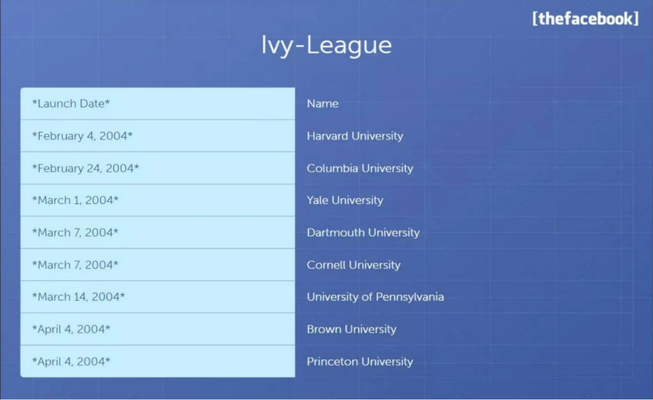
Thefacebook.com was launched on February 4, 2004 at Harvard University. As of April 10, 2004, the expansion of thefacebook.com network has yielded the following member schools:
Visuals: One line-art illustration of a school building, drawn in semi-transparent white outline at low opacity (about 15-20%) and placed centrally behind the title and body text. It shows a flagpole with a rectangular flag at top, a triangular pediment over a tall central tower with a rounded arched doorway and two round-top windows on each side, and a lower wide facade with a 6-by-3 grid of small square windows, sitting on a horizontal base line. No photographs or charts. The building is not cropped and has no overlay beyond the transparency. Its dominant colour is a pale blue-white (#A9BEE6) at low opacity against the blue background.
Slide 10
[thefacebook]
Ivy-League
*Launch Date*
Name
*February 4, 2004*
Harvard University
*February 24, 2004*
Columbia University
*March 1, 2004*
Yale University
*March 7, 2004*
Dartmouth University
*March 7, 2004*
Cornell University
*March 14, 2004*
University of Pennsylvania
*April 4, 2004*
Brown University
*April 4, 2004*
Princeton University
Visuals: None apart from the table. The table has 9 rows and 2 columns. Left column values, top to bottom: *Launch Date*, *February 4, 2004*, *February 24, 2004*, *March 1, 2004*, *March 7, 2004*, *March 7, 2004*, *March 14, 2004*, *April 4, 2004*, *April 4, 2004*. Right column values, top to bottom: Name, Harvard University, Columbia University, Yale University, Dartmouth University, Cornell University, University of Pennsylvania, Brown University, Princeton University. No chart, photograph or logo beyond the [thefacebook] wordmark.
Slide 11
[thefacebook]
Other Schools
*Launch Date*
Name
*Launch Date*
Name
*February 26, 2004*
Stanford University
*April 11, 2004*
Georgetown University
*March 14, 2004*
MIT
*April 11, 2004*
University of Virginia
*March 21, 2004*
New York University
*April 19, 2004*
Tufts University
*March 21, 2004*
Boston University
*April 19, 2004*
Boston College
*April 4, 2004*
UC Berkeley
*April 19, 2004*
Northeastern University
*April 11, 2004*
Duke University
*April 19, 2004*
University of Illinois
Visuals: A table with four columns: '*Launch Date*', 'Name', '*Launch Date*', 'Name'. Header row: light cyan fill (#C8EEFB) with dark navy text. Rows, left pair then right pair: *February 26, 2004* | Stanford University | *April 11, 2004* | Georgetown University; *March 14, 2004* | MIT | *April 11, 2004* | University of Virginia; *March 21, 2004* | New York University | *April 19, 2004* | Tufts University; *March 21, 2004* | Boston University | *April 19, 2004* | Boston College; *April 4, 2004* | UC Berkeley | *April 19, 2004* | Northeastern University; *April 11, 2004* | Duke University | *April 19, 2004* | University of Illinois. Data rows are transparent over the blue background with thin lighter-blue horizontal rules; a faint vertical divider separates the two pairs. The header has rounded top corners. No photographs or logos other than the wordmark.
Slide 12
[thefacebook]
The Expansion Plan
The mission of thefacebook.com is to expand to include most of the schools in the
United States. By September 1, 2004, thefacebook.com network will have more
than 200 member schools.
Visuals: A large, faint, semi-transparent white upward-pointing arrow icon behind the title and body text, centred horizontally at about x 50%, spanning roughly y 25% to 73%. It is built from a vertical shaft with a chevron arrowhead at the top, a smaller second arrow to its left and a third arrow to its right, all joined to a horizontal base bar at the bottom (about y 70%). It is rendered at low opacity (about 15%) in lighter blue-white. A faint grid pattern of thin lighter lines covers the background at about 10% spacing.
Slide 13
[thefacebook]
Our audience - The College Addiction
There are 15 million college students in the United States. With an estimated purchasing power that exceeds $85 billion, college students have money in their pockets for your services and products. This year they will spend $21 billion on restaurants and food, $9 billion on automobiles, $5 billion on clothes, $4 billion on phones and $46 billion on other amenities. College students are also active job seekers.
Slide 14
[thefacebook]
User Base Demographics*
TOTAL STUDENTS: 70, 000
Other / Schools - / 45
Ivy- / League - / 55
*Based on March 2004 Monthly Statistics
Visuals: Pie chart with no visible axes. Title: none printed. Two slices, both with leader lines to external labels: 'Other Schools - 45' occupies the left (white) slice, about 45% of the pie; 'Ivy-League - 55' occupies the right (pale light-blue) slice, about 55% of the pie. The division line runs from the pie centre straight up to 12 o'clock on the right boundary and down-left to about 7 o'clock on the bottom-left, so the Ivy-League slice spans the top-right portion clockwise from 12 o'clock to about 7 o'clock. Values printed as 45 and 55 with no units; no legend. Pie diameter about 36% of slide width, centred at about x 50%, y 63%. Slice edges have a thin dark navy outline. Faint grid lines in the background run horizontally and vertically at regular intervals (about every 12.5% of width and height), giving a subtle tiled pattern.
Slide 15
[thefacebook]
User Base Demographics*
TOTAL STUDENTS: 70, 000
Faculty-
Staff - 2
Alumi - 11
Students -
87
*Based on March 2004 Monthly Statistics
Visuals: One pie chart, untitled apart from the slide title, with three slices in clockwise order from 12 o'clock: Faculty-Staff (2) as a thin bright sky-blue wedge about 2% of the circle at the top just right of 12 o'clock; Alumni (11) as a white wedge about 11% to the upper left; Students (87) as the large pale-blue wedge filling the rest. Labels sit outside the circle with thin leader lines: 'Faculty-Staff - 2' above-left, 'Alumi - 11' to the left, and 'Students - 87' below-right. The values are printed as shown, with no axes, legend or highlighted points. The slices have thin dark-navy outlines about 1px wide.
Slide 16
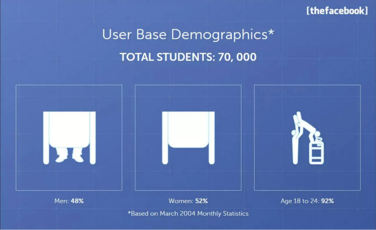
[thefacebook] / User Base Demographics* / TOTAL STUDENTS: 70, 000 / Men: 48% / Women: 52% / Age 18 to 24: 92% / *Based on March 2004 Monthly Statistics
Visuals: Three white pictogram icons, each inside a thin outlined square panel. Panel 1 (left): a white school-desk-style table shape with a pair of legs and shoes visible beneath it, a figure hidden under the desk. Panel 2 (centre): the same white desk shape with no figure beneath it, empty. Panel 3 (right): a white stick figure leaning forward over a stacked box or stool shape with horizontal bands. Background carries a faint white grid of thin lines, like a blueprint. No chart, photograph or logo beyond the wordmark.
Slide 17
[thefacebook]
Site Usage*
TOTAL STUDENTS: 70, 000
Daily Unique Users
65%
Monthly Unique Users
95%
Daily Traffic in Pageviews
3 million*
*Based on March 2004 Monthly Statistics
Visuals: Three line icons, one per column, in pale blue-white outline style. Column 1: a group of five stylised standing people of varying heights and poses, with one figure in profile, drawn in thin double-line outlines. Column 2: a mobile phone outline showing a status bar, a few text lines and a calendar-style grid of small squares with the number 11 in the top-right, plus a home button at the bottom. Column 3: a computer monitor outline displaying a line chart with an upward arrow and three vertical bar columns, on a stand. Each icon sits centred inside its thin-outlined square box. No photographs or charts with numeric axes.
Slide 18
[thefacebook]
Site Usage*
Monthly Traffic in Pageviews
90 MILLION
*Based on March 2004 Monthly Statistics
Visuals: One pictogram illustration: four identical simplified standing figures in a row, each with a round head with a small dark centre dot, a rounded-rectangle body and two rounded legs, with a row of four short arched 'signal' or 'crowd' arcs above their heads, arranged in a staggered pattern. The figures and arcs are white at roughly 20 to 25 percent opacity, so they read as a faint watermark behind the title and stat text. Composition is centred and fully visible, not cropped, with no photograph. No chart, table, or logo beyond the wordmark.
Slide 19
[thefacebook] / The Daily Pennsylvania / I have a new addiction. It is powerful. It is / disturbing. It is thefacebook.com / 03/25/04 / "
Visuals: Two non-photographic visual elements. (1) A short thin horizontal line, pale blue-white (#B8D4F0), about 0.3% of slide height thick, running from about x 21% to x 42%, immediately left of the attribution line, with no end caps. (2) A small closing double quotation mark in white italic, placed under the date and right-aligned to the text block. The slide also carries a faint background grid of thin lighter-blue lines (about 1 px, roughly 10% of slide width apart horizontally and about 16% of height apart vertically) that run behind the whole slide. No photographs, charts, tables, or logos other than the wordmark are present.
Slide 20
[thefacebook]
User Growth Rate
The growth rate of the total number of users is increasing, with the addition of 10, 000 thefacebook.com members in the first week of April, 2004.
The percentage of daily unique users has slightly increased through time.
The monthly traffic in pageviews has grown through time in proportion to the growth rate of the user base.
Slide 21
Our services - Online Marketing Services / [thefacebook]
Visuals: A large translucent white presentation-easel icon sits centred behind the title. The easel has a trapezoid stand at the top, a rounded-rectangle board with a thin inner frame, and two splayed legs at the bottom. Inside the board is a picture glyph: a circle (sun or head) at upper left and a large mountain triangle at lower right. The icon is white at roughly 15 to 20% opacity, so it reads as a faint watermark. A faint grid of thin lighter-blue lines runs across the whole background at roughly 10% intervals, at about 10% opacity. No photographs or charts.
Slide 22
Advertisement
thefacebook.com website allows your company to reach college students, alumni, faculty and staff at the library, their work, home or dorm rooms.
You can target users using traditional horizontal/vertical banners, links and other more contextual ad placements. We will help you identify the most effective placements to reach the goals of your campaign.
[thefacebook]
Visuals: One line-art icon of a desktop monitor overlapping a smartphone, drawn in white with rounded strokes, with small white cross, circle and sparkle marks around the outline. The icon sits centred inside a thin light-blue outlined rectangle on the right side of the slide, with no fill. The monitor is landscape with a short stand; the phone is in front at lower right with a stand below it. Lighting is flat, with no photograph. No chart, table or photograph.
Slide 23
[thefacebook]
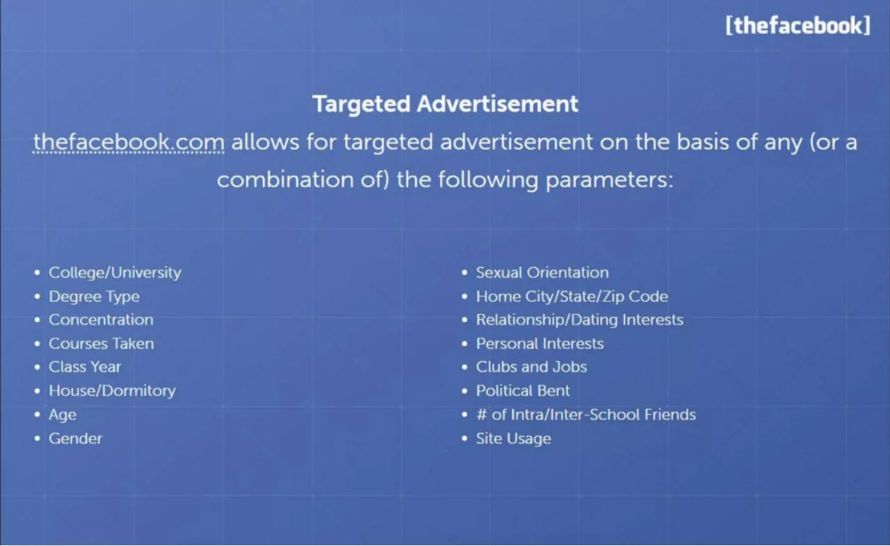
Targeted Advertisement
thefacebook.com allows for targeted advertisement on the basis of any (or a combination of) the following parameters:
College/University
Degree Type
Concentration
Courses Taken
Class Year
House/Dormitory
Age
Gender
Sexual Orientation
Home City/State/Zip Code
Relationship/Dating Interests
Personal Interests
Clubs and Jobs
Political Bent
# of Intra/Inter-School Friends
Site Usage
Visuals: Non-text visuals: none apart from the wordmark logo. The logo is the text '[thefacebook]' in a white bold sans-serif with square brackets, top right. The background carries a faint lighter grid of thin horizontal and vertical lines roughly every 10% of the slide, which reads as a subtle texture rather than an image. No chart, table, photograph, diagram or icon is present.
Slide 24
[thefacebook]
Rates
Banner ads rates vary based on scope, duration and targeting.
Available sizes include 468x60, 120x240, 120x90 and 125x125.
Link rates vary based on targeting.
Please contact us for further information and a rate card. Please indicate advertising intentions, including the duration, targeting and budget.
Slide 25
[thefacebook]
Contact Us
If you are interested in our online marketing services, please contact us via e-mail. We will help expose your product, service or recruitment effort to thousands of college students, alumni, faculty and staff throughout the country.
Eduardo Saverin
CFO, Thefacebook.com
Cambridge, MA 02138
Visuals: One circular headshot photograph of a man (Eduardo Saverin) with short dark brown hair, smiling slightly, wearing a dark suit jacket, white collared shirt and an olive-and-gold striped tie, facing the camera in head-and-shoulders framing. Background behind him is white with a faint partial teal logo fragment cut off at the left edge. The photo is cropped to a circle and sits on the blue background with no border or shadow. Lighting is even and frontal. Dominant colours: white, dark navy-black suit, skin tones, olive tie. No charts, tables or other graphics.
Slide 26
[thefacebook]
The Harvard Independent
The wonderful thing about The Facebook is its ability
to connect so many people through so many
different avenues, including courses, interests,
houses, politics, concentration, and favourite movies.
03/04/04
"
Visuals: none (only a faint grid-line texture in the background, with thin lighter lines spaced roughly every 10% of the width and height and a few diagonal hairlines; no photographs, charts or icons)